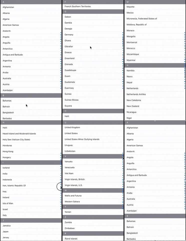
A simple React Native component that takes an array of data and renders a SectionList with alphabetically (or custom) sorted data.
Unlike alternatives, this package takes an array of data rather than an object with letters as keys.
For example,
Other packages
const data = {
  A: [{...}, ...],
  B: [{...}, ...],
  C: [{...}, ...],
  ...
}
This package
const data = [{...}, {...}, {...}, ...]For react-native-section-alphabet-list, the data does not need to be pre-formatted and sorted before use. The component handles all this logic internally. You can also provide an array of characters to sort your sections in a custom order.
Using npm:
npm install react-native-section-alphabet-listor with yarn:
yarn add react-native-section-alphabet-listimport { AlphabetList } from "react-native-section-alphabet-list";
const data = [
{ value: 'Lillie-Mai Allen', key: 'lCUTs2' },
{ value: 'Emmanuel Goldstein', key: 'TXdL0c' },
{ value: 'Winston Smith', key: 'zqsiEw' },
{ value: 'William Blazkowicz', key: 'psg2PM' },
{ value: 'Gordon Comstock', key: '1K6I18' },
{ value: 'Philip Ravelston', key: 'NVHSkA' },
{ value: 'Rosemary Waterlow', key: 'SaHqyG' },
{ value: 'Julia Comstock', key: 'iaT1Ex' },
{ value: 'Mihai Maldonado', key: 'OvMd5e' },
{ value: 'Murtaza Molina', key: '25zqAO' },
{ value: 'Peter Petigrew', key: '8cWuu3' },
]
render() {
return (
<AlphabetList
data={data}
indexLetterColor={'blue'}
renderCustomItem={(item) => (
<View style={styles.listItemContainer}>
<Text style={styles.listItemLabel}>{item.value}</Text>
</View>
)}
renderCustomSectionHeader={(section) => (
<View style={styles.sectionHeaderContainer}>
<Text style={styles.sectionHeaderLabel}>{section.title}</Text>
</View>
)}
/>
)
}| Prop | Description | Type | Signature (func) | Default |
|---|---|---|---|---|
data |
List of objects to be sorted and rendered in the SectionList. Each item must have both a value property and unique a key property. |
array |
||
index (optional) |
The characters used to sort each item into sections. These characters are rendered on the right-hand side and clicking on each item scrolls the user to its respective section. The default is the letters of the alphabet. | array |
['a', 'b', 'c', 'd', 'e', 'f', ...] (see DEFAULT_CHAR_INDEX here) |
|
renderCustomItem (optional) |
Render a row in the SectionList. Should return a valid React Element. | func |
{ item: { value: string, key: string } } : ReactElement |
|
renderCustomSectionHeader (optional) |
Render a section header in the SectionList. Should return a valid React Element. | func |
{ section: { title: string, index: number, data: array } } : ReactElement |
|
getItemHeight (optional) |
For sectionListGetItemLayout. This may be necessary if each item has a dynamic height. This allows for smooth scrolling and accurate positioning when scrolling to a section. |
func |
{ sectionIndex: number, rowIndex: number } : number |
|
sectionHeaderHeight (optional) |
The height of the section header. | number |
40 |
|
indexLetterColor (optional) |
Changes the colour of each character in the letter index. | string |
#007aff |
|
uncategorizedAtTop (optional) |
If true, the uncategorised items (the # section) is moved to the top of the list. |
boolean |
false |
You can also provide any valid SectionList props. A list of available props can be found here.
You can provide a custom array of characters to the component using the index prop. For example, if we wanted to sort alphabetically in-reverse, we could do:
const customIndex = [
  'z',
  'y',
  'x',
  'w',
  ...
]

<AlphabetList
  ...
  index={customIndex}
/>Pull requests are welcome. For major changes, please open an issue first to discuss what you would like to change.
Please make sure to update the tests as appropriate.
