
A banner component for displaying important information, alerts, notifications, and types of messages within a Gradio Blocks.
pip install gradio_bannerimport gradio as gr
from gradio_banner import Banner
with gr.Blocks() as demo:
with gr.Row():
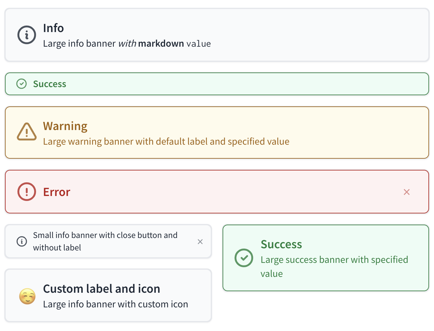
Banner(value="Large info banner *with* **markdown** `value`", variant="info")
with gr.Row():
Banner(variant="success", size="sm")
with gr.Row():
Banner(value="Large warning banner with default label and specified value", variant="warning")
with gr.Row():
Banner(variant="error", show_close_button=True)
with gr.Row():
with gr.Column():
with gr.Row():
Banner(value="Small info banner with close button and without label", size="sm", show_close_button=True, show_label=False)
with gr.Row():
Banner(label="Custom label and icon", value="Large info banner with custom icon", icon="https://i.pinimg.com/originals/e9/ab/30/e9ab30fdcadf40bdc095a1e317f3851c.gif")
with gr.Column():
Banner(value="Large success banner with specified value", variant="success")
if __name__ == "__main__":
demo.launch()| name | type | default | description |
|---|---|---|---|
value |
|
None |
The main text of the banner. Supports markdown formatting. If a callable, will be executed to get the value. |
variant |
|
"info" |
Type of banner to display. Options are 'info', 'warning', 'error', and 'success'. |
label |
|
None |
The headline of the banner. Supports markdown formatting. |
icon |
|
None |
URL or path to the icon file to display within the banner. If None, default icon will be used. |
size |
|
"lg" |
Size of the banner. Can be "sm" (small) or "lg" (large). Defaults to "lg". |
show_close_button |
|
False |
If True, shows a close button to hide the banner. |
show_icon |
|
True |
If True, displays the icon specified in the icon parameter. Defaults to True. |
every |
|
None |
Continuously calls `value` to recalculate it if `value` is a function (has no effect otherwise). Can provide a Timer whose tick resets `value`, or a float that provides the regular interval for the reset Timer. |
inputs |
|
None |
Components that are used as inputs to calculate `value` if `value` is a function (has no effect otherwise). `value` is recalculated any time the inputs change. |
show_label |
|
None |
If True, will display the label. Defaults to True. |
scale |
|
None |
Relative size compared to adjacent Components. For example, if Components A and B are in a Row, and A has scale=2, and B has scale=1, A will be twice as wide as B. Should be an integer. Scale applies in Rows, and to top-level Components in Blocks where fill_height=True. |
min_width |
|
160 |
Minimum pixel width, will wrap if not sufficient screen space to satisfy this value. If a certain scale value results in this Component being narrower than min_width, the min_width parameter will be respected first. |
visible |
|
True |
If False, the component will be hidden. Defaults to True. |
rtl |
|
False |
If True, sets the direction of the text to right-to-left (cursor appears on the left of the text). Default is False, which renders cursor on the right. |
elem_id |
|
None |
An optional string that is assigned as the id of this component in the HTML DOM. Can be used for targeting CSS styles. |
elem_classes |
|
None |
An optional list of strings that are assigned as the classes of this component in the HTML DOM. Can be used for targeting CSS styles. |
render |
|
True |
If False, the component will not be rendered in the Blocks context. Should be used if the intention is to assign event listeners now but render the component later. Defaults to True. |
key |
|
None |
If assigned, will be used to assume identity across a re-render. Components that have the same key across a re-render will have their value preserved. |
| name | description |
|---|---|
change |
Triggered when the value of the Banner changes either because of user input (e.g. a user types in a textbox) OR because of a function update (e.g. an image receives a value from the output of an event trigger). See .input() for a listener that is only triggered by user input. |
input |
This listener is triggered when the user changes the value of the Banner. |
submit |
This listener is triggered when the user presses the Enter key while the Banner is focused. |
The impact on the users predict function varies depending on whether the component is used as an input or output for an event (or both).
- When used as an Input, the component only impacts the input signature of the user function.
- When used as an output, the component only impacts the return signature of the user function.
The code snippet below is accurate in cases where the component is used as both an input and an output.
- As output: Is passed, passes text value as a {str} into the function.
- As input: Should return, expects a {str} returned from function and sets textarea value to it.
def predict(
    value: str | None
) -> str | None:
    return value