Here we want to perform time series analysis on daily precipitation data (stored as PPT_data.csv).
Boxplots were used to present the Month-wise or seasonal and Year-wise or trend distribution of data.
The PPT data (timeseries) were splitted (decomposed) into the following components: Base level + Trend +Seasonality + Error.
The satatonarity as a property of the time series also was checked using two methods to check if the series is a function of time.
Smoothen of the time series were used to reduce the effect of noise in a signal and get a fair approximation of the noise-filtered series and also to visualize the underlying trend better.
Precipitation data downloaded from https://power.larc.nasa.gov/ for Texas.
PPT_data folder consist of the data were used in this project
- Python 3.7
- seaborn
- numpy
- datetime
- statsmodels
- pandas
- matplotlib
Herein, we describe the use of Python packages for this project.
Packages import:
import matplotlib as mpl
import matplotlib.pyplot as plt
import seaborn as sns
import numpy as np
import pandas as pd
import datetime
from statsmodels.tsa.seasonal import seasonal_decompose
from dateutil.parser import parse
from statsmodels.tsa.stattools import adfuller, kpss
from pandas.plotting import autocorrelation_plot
from statsmodels.nonparametric.smoothers_lowess import lowess
Import data as Dataframe
raw_csv_data = pd.read_csv("data/Data.out")Changing the type of "Date" column to datetime
df = pd.read_csv('../PPT_data/PPT_data.csv')
df["Date"]=pd.to_datetime(df["Date"], format="%m/%d/%Y")
Define a function to remove outliers
def remove_outlier(DF,col_name,coef):
    originalArray=DF[col_name]
    Mean=np.mean(originalArray)
    std=np.std(originalArray)
    bool=((DF[col_name]>Mean+coef*std) | (DF[col_name]<Mean-coef*std))
    CleanedDF=DF[~bool]
    return CleanedDF
Use function to remove outliers
df=remove_outlier(df,"PPT[mm]",3)Define start and end date that will use
startDate = datetime.datetime.strptime("01/01/2017", "%m/%d/%Y")
EndDate = datetime.datetime.strptime("12/30/2019", "%m/%d/%Y")
Define Boolean and select dates between start date and end date
BoolL_Data = ((df["Date"] > startDate) & (df["Date"] < EndDate))
df = df[BoolL_Data]
Define a function and use matplotlib to visualise the series
def plot_df( x, y, title="", xlabel='Date', ylabel='PPT', dpi=100):
    plt.figure(figsize=(10,4), dpi=dpi)
    plt.plot(x, y, color='tab:blue')
    plt.gca().set(title=title, xlabel=xlabel, ylabel=ylabel)
    plt.savefig('../Results/PPT_timeSeries.png')
    plt.close()
Use the function to visualize a PPT time series
plot_df(x=df['Date'], y=df["PPT[mm]"], title='Daily precepitation [mm]')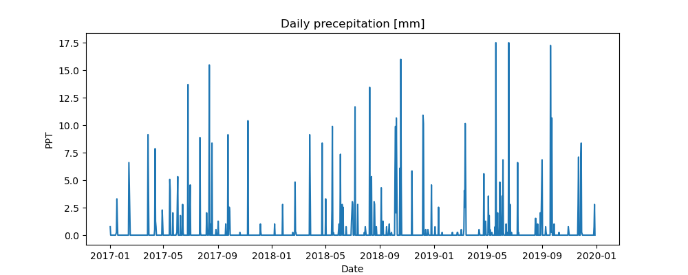
Define a boolean to remove zero values
bool=df["PPT[mm]"]==0
df=df[~bool]
Boxplot of Month-wise (Seasonal) and Year-wise (trend) Distribution
df['year'] = [d.year for d in df["Date"]]
df['month'] = [d.strftime('%b') for d in df["Date"]]
years = df['year'].unique()
fig, axes = plt.subplots(1, 2, figsize=(12,4), dpi= 80)
sns.boxplot(x='year', y='PPT[mm]', data=df, ax=axes[0])
sns.boxplot(x='month', y='PPT[mm]', data=df.loc[~df.year.isin([2017, 2020]), :])
axes[0].set_title('Year-wise Box Plot\n(The Trend)', fontsize=18);
axes[1].set_title('Month-wise Box Plot\n(The Seasonality)', fontsize=18)
axes[0].set_ylabel("PPT [mm]", fontsize=14)
axes[0].set_xlabel("Year", fontsize=14)
axes[1].set_ylabel("PPT [mm]", fontsize=14)
axes[1].set_xlabel("Month", fontsize=14)
plt.tight_layout()
plt.savefig('../Results/PPT_Boxplots.png')
plt.close()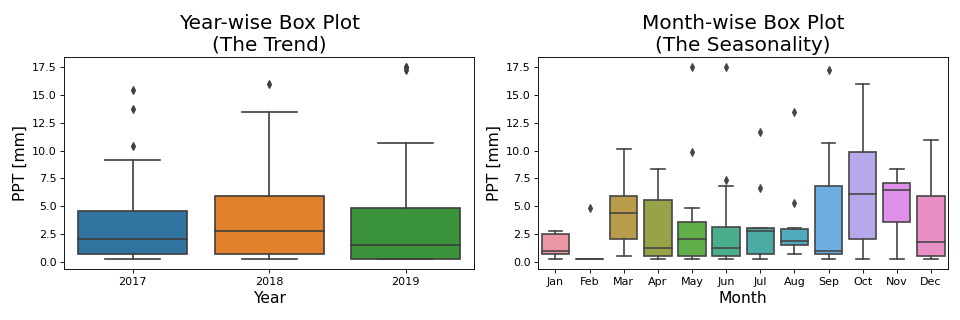
Patterns in time series Multiplicative Decomposition
df.set_index("Date", inplace=True)
result_mul = seasonal_decompose(df['PPT[mm]'], model='multiplicative', extrapolate_trend='freq',period=3)
Additive Decomposition
result_add = seasonal_decompose(df['PPT[mm]'], model='additive', extrapolate_trend='freq',period=3)
plt.rcParams.update({'figure.figsize': (10,12)})
result_mul.plot().suptitle('Multiplicative Decompose', fontsize=22)
result_add.plot().suptitle('Additive Decompose', fontsize=22)
Put additive decomposition results in a DataFrame
df_reconstructed_add = pd.concat([result_add.seasonal, result_add.trend, result_add.resid, result_add.observed],axis=1)
df_reconstructed_add.columns = ['seas', 'trend', 'resid', 'actual_values']
Another way to Plot decomposition data with this function
def plot_decompose(DF,colName,ylabel):
    plt.gca()
    plt.plot(DF[colName], color="blue")
    plt.title("Additive decomposition", fontsize=16)
    plt.ylabel(ylabel, fontsize=14)
plt.figure(figsize=(10,10))
plt.subplot(4,1,1)
plot_decompose(df_reconstructed_add,"actual_values","Observed")
plt.subplot(4, 1, 2)
plot_decompose(df_reconstructed_add,"trend","Trend")
plt.subplot(4, 1, 3)
plot_decompose(df_reconstructed_add,"seas","Seasonal")
plt.subplot(4, 1, 4)
plt.scatter(df_reconstructed_add.index,df_reconstructed_add["resid"],color="blue",facecolor="none")
plt.axhline(y=0)
plt.ylabel("Residual",fontsize=14)
plt.xlabel("Date", fontsize=14)
plt.tight_layout()
plt.savefig('../Results/Decompose.png')
plt.close()
Stationarity test using Augmented Dickey Fuller test (ADH Test) and Kwiatkowski-Phillips-Schmidt-Shin – KPSS test (trend stationary) ADF Test: the null hypothesis is the time series possesses a unit root and is non-stationary. So, id the P-Value in ADH test is less than the significance level (0.05), you reject the null hypothesis.
result = adfuller(df["PPT[mm]"].values, autolag='AIC')
print(f'ADF Statistic: {result[0]}')
print(f'p-value: {result[1]}')
for key, value in result[4].items():
    print('Critial Values:')
    print(f'   {key}, {value}')
ADF results ADF Statistic: -12.946856809809937
p-value: 3.44126071094833e-24
Critial Values:
1%, -3.474120870218417
Critial Values:
5%, -2.880749791423677
Critial Values:
10%, -2.5770126333102494
KPSS Test: #The null hypothesis and the P-Value interpretation is just the opposite of ADH test. The below code implements these two tests using statsmodels package in python.
result = kpss(df["PPT[mm]"].values, regression='c')
print('\nKPSS Statistic: %f' % result[0])
print('p-value: %f' % result[1])
for key, value in result[3].items():
    print('Critial Values:')
    print(f'   {key}, {value}')
KPSS results
KPSS Statistic: 0.063848
p-value: 0.100000
Critial Values:
10%, 0.347
Critial Values:
5%, 0.463
Critial Values:
2.5%, 0.574
Critial Values:
1%, 0.739
Smoothen time series
Loess Smoothing (5% and 15%)
df_loess_5 = pd.DataFrame(lowess(df["PPT[mm]"], np.arange(len(df["PPT[mm]"])), frac=0.05)[:, 1], index=df.index, columns=["PPT[mm]"])
df_loess_15 = pd.DataFrame(lowess(df["PPT[mm]"], np.arange(len(df["PPT[mm]"])), frac=0.15)[:, 1], index=df.index, columns=['PPT[mm]'])
Smoothen Plots
fig, axes = plt.subplots(3,1, figsize=(7, 7), sharex=True, dpi=120)
df['PPT[mm]'].plot(ax=axes[0], color='k', title='Original Series')
df_loess_5['PPT[mm]'].plot(ax=axes[1], title='Loess Smoothed 5%')
df_loess_15['PPT[mm]'].plot(ax=axes[2], title='Loess Smoothed 15%')
fig.suptitle('Smoothen a Time Series', y=0.95, fontsize=14)
plt.savefig('../Results/PPT_Loess.png')