🎺 A collection of Jetpack Compose libraries, which are compatible with custom views for Android.
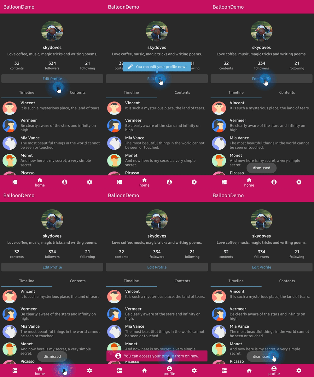
Orchestra Balloon allows you to build modernized and sophisticated tooltips, fully customizable with an arrow and animations for Jetpack Compose. This is a Jetpack Compose compatible package of Balloon.
Add the codes below to your root build.gradle file (not your module build.gradle file):
allprojects {
    repositories {
        mavenCentral()
    }
}
Next, add the dependency below to your module's build.gradle file:
dependencies {
    implementation "com.github.skydoves:orchestra-balloon:1.2.0"
}BalloonAnchor composable can be used in ConstraintLayout and it receives a constraint reference. In the below, BalloonAnchor references image composable. When clicked the image composable, balloon popup will be shown.
ConstraintLayout {
  val (image, title, content, message) = createRefs()

  // image, title, content, message //

  BalloonAnchor(
    reference = image,
    modifier = Modifier.aspectRatio(0.8f),
    balloon = BalloonUtils.getTitleBalloon(
      context = context,
      title = poster.name,
      lifecycle = lifecycleOwner
    ),
    onAnchorClick = { balloon, anchor -> balloon.show(anchor) }
  )
Or we can create a BalloonAnchor composable using Balloon.Factory.
BalloonAnchor(
  reference = image,
  modifier = Modifier.aspectRatio(0.8f),
  factory = MyBalloonFactory::class,
  onAnchorClick = { balloon, anchor -> balloon.show(anchor) },
  onBalloonClick = { },
  onBalloonDismiss = { },
  onBalloonInitialized = { content -> },
  onBalloonOutsideTouch = { content, event -> }
)Orchestra ColorPicker allows you to build color picker for getting colors from any images by tapping on the desired color for Jetpack Compose. This is a Jetpack Compose compatible package of ColorPickerView.
Add the dependency below to your module's build.gradle file:
dependencies {
    implementation "com.github.skydoves:orchestra-colorpicker:$version"
}ColorPicker composable implements a color picker with AlphaSlideBar and BrightnessSlideBar. We can create an alpha sidebar and brightness sidebar for changing saturation and lightness by tapping on the desired color. They should be used in children inner composable in ColorPicker, and they receive a colorPickerView as a parameter.
val (selectedColor, setSelectedColor)
      = remember { mutableStateOf(ColorEnvelope(0)) }
ColorPicker(
    modifier = Modifier.fillMaxWidth().height(400.dp),
    onColorListener = { envelope, _ ->
      setSelectedColor(envelope)
    },
    initialColor = purple500,
    children = { colorPickerView ->
      Column(modifier = Modifier.padding(top = 32.dp)) {
        Box(modifier = Modifier.padding(vertical = 6.dp)) {
          AlphaSlideBar(
            modifier = Modifier.fillMaxWidth().height(30.dp)
              .clip(RoundedCornerShape(4.dp)),
            colorPickerView = colorPickerView
          )
        }
        Box(modifier = Modifier.padding(vertical = 6.dp)) {
          BrightnessSlideBar(
            modifier = Modifier.fillMaxWidth().height(30.dp)
              .clip(RoundedCornerShape(4.dp)),
            colorPickerView = colorPickerView
          )
        }
      }
    }
)In a normal View, it can not represent ARGB colors accurately. Because a color will be mixed with the parent's background-color. For resolving it we can use AlphaTileBox composable. AlphaTileBox composable reflects ARGB colors.
AlphaTileBox(
  modifier = modifier.constrainAs(square) {
    bottom.linkTo(parent.bottom)
    centerHorizontallyTo(parent)
  }.size(64.dp).clip(RoundedCornerShape(4.dp))
) {
  it.setBackgroundColor(selectedColor.color)
}Orchestra Spinner allows you to build a lightweight dropdown popup spinner, fully customizable with an arrow and animations for Jetpack Compose. This is a Jetpack Compose compatible package of PowerSpinner.
Add the dependency below to your module's build.gradle file:
dependencies {
    implementation "com.github.skydoves:orchestra-spinner:$version"
}Spinner composable implements a lightweight dropdown popup spinner. Here is an example for creating a spinner using a string array resource. We should use the String generic type for creating a spinner when we us a string array resource.
 val (selectedItem, setSelectedItem)
      = remember { mutableStateOf("Choose a question") }
 Spinner<String>(
      text = selectedItem0,
      modifier = Modifier.fillMaxWidth().padding(16.dp)
        .background(blue200)
        .align(Alignment.CenterHorizontally),
       itemListRes = R.array.list_spinner,
      style = MaterialTheme.typography.body2,
      properties = SpinnerProperties(
        color = Color.White,
        textAlign = TextAlign.Center,
        showDivider = true,
        dividerColor = white87,
        overflow = TextOverflow.Ellipsis,
        maxLines = 1,
        spinnerPadding = 16.dp,
        spinnerBackgroundColor = MaterialTheme.colors.onBackground,
      ),
      onSpinnerItemSelected = { index, item ->
        setSelectedItem(item)
      }
    )
Here is an another example using a List for creating a spinner. In this case, we don't need to decide a generic type of Spinner.
 val coffeeList = remember { listOf("Americano", "Cold Brew", "Espresso", "Latte") }
 val (selectedItem1, setSelectedItem1) = remember { mutableStateOf("Choose your coffee") }
 Spinner(
      text = selectedItem1,
      modifier = Modifier.fillMaxWidth().padding(16.dp)
        .background(amber700)
        .align(Alignment.CenterHorizontally),
      itemList = coffeeList,
      style = MaterialTheme.typography.body2,
      properties = SpinnerProperties(
        color = Color.White,
        textAlign = TextAlign.Center,
        dividerColor = white87,
        overflow = TextOverflow.Ellipsis,
        maxLines = 1,
        spinnerPadding = 16.dp,
        spinnerBackgroundColor = MaterialTheme.colors.onBackground,
      ),
      onSpinnerItemSelected = { index, item ->
        setSelectedItem1(item)
      }
)Support it by joining stargazers for this repository. ⭐
And follow me for my next creations! 🤩
Designed and developed by 2020 skydoves (Jaewoong Eum)

Licensed under the Apache License, Version 2.0 (the "License");
you may not use this file except in compliance with the License.
You may obtain a copy of the License at

   http://www.apache.org/licenses/LICENSE-2.0

Unless required by applicable law or agreed to in writing, software
distributed under the License is distributed on an "AS IS" BASIS,
WITHOUT WARRANTIES OR CONDITIONS OF ANY KIND, either express or implied.
See the License for the specific language governing permissions and
limitations under the License.


