Generated forms start you off on a good place to manage the object's content, but chances are you'll want to customize them and add more fields as you data model evolves. Fae provides a number of form helpers to help you leverage Fae's built in features will allowing customization when needed.
Form helpers in Fae use the simple_form gem as it's base. In most cases options that simple_form accepts can be passed into these helpers directly. The reason why we've established these helpers is to allow for customized options. They also provide a method to directly hook into Fae, so we can push out features and bugfixes.
- Format
- Fae Input
- Fae Association
- Fae Checkbox
- Fae Radio
- Fae Pulldown
- Fae Multiselect
- Fae Grouped Select
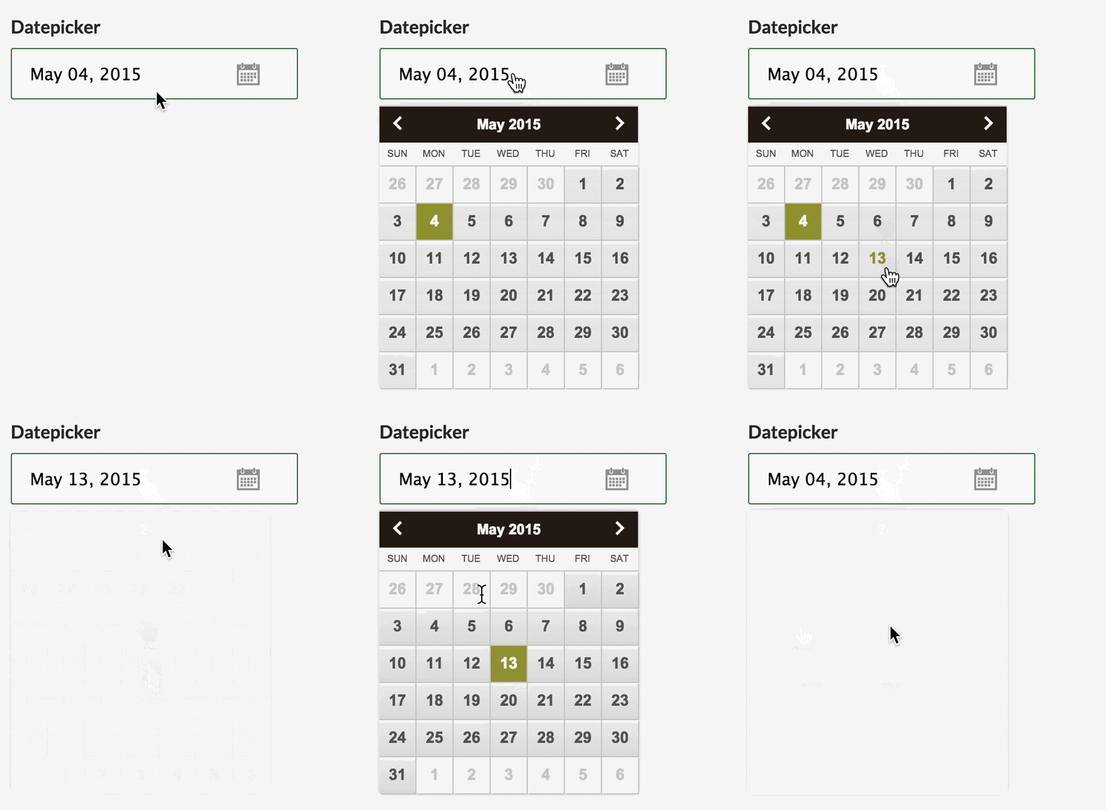
- Fae Datepicker
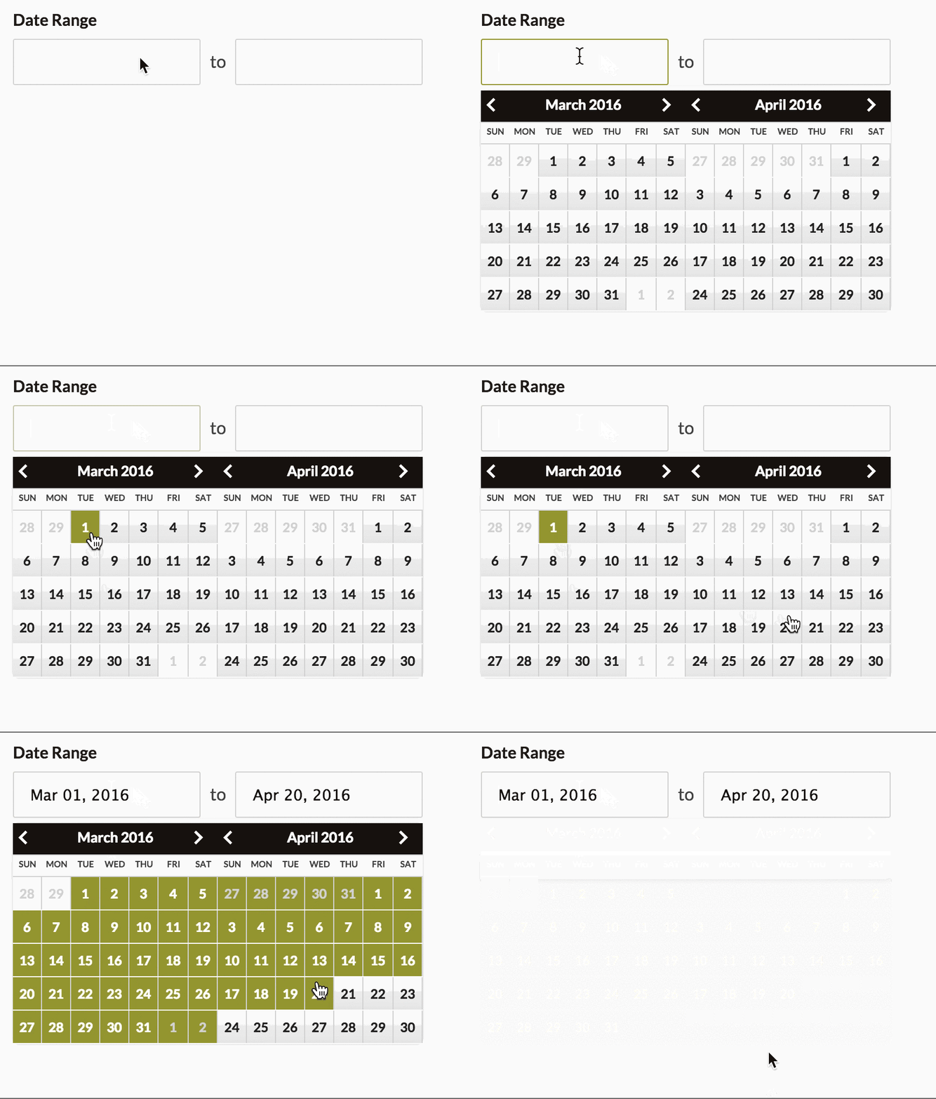
- Fae Daterangepicker
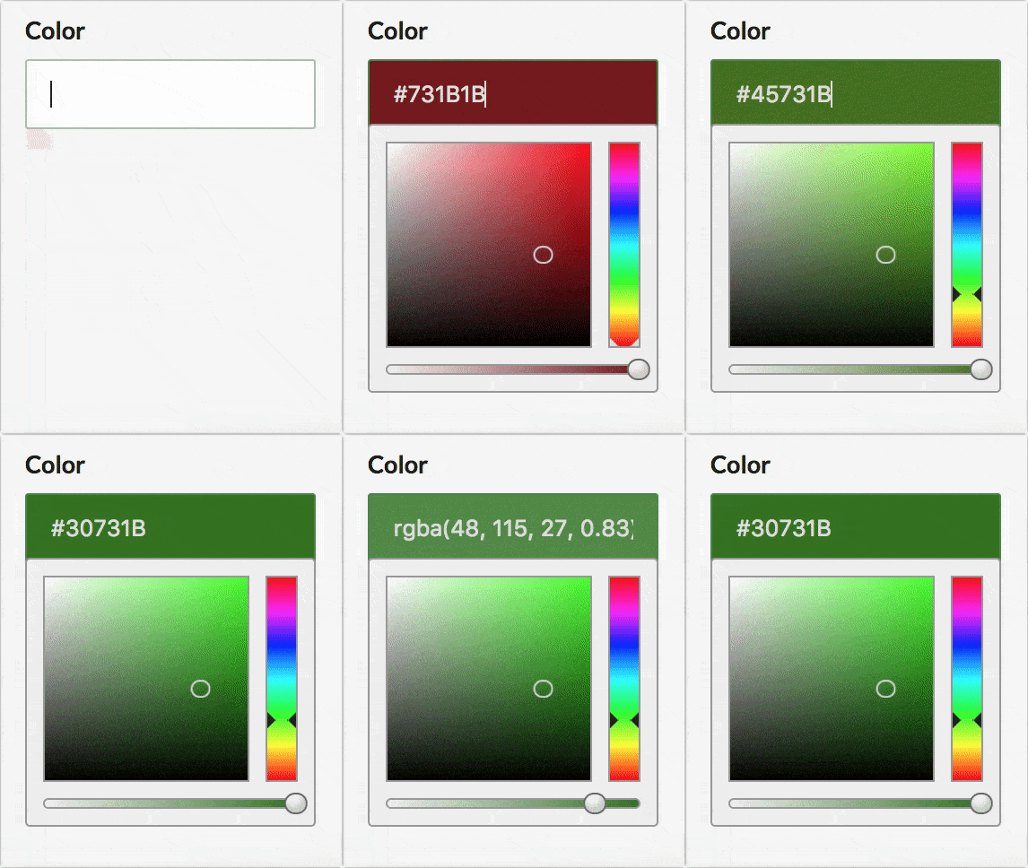
- Fae Colorpicker
- Fae Prefix
- Fae Suffix
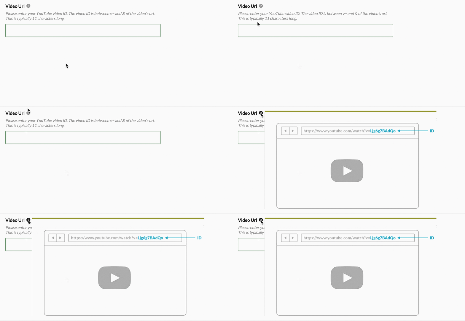
- Fae Video URL
All form helpers are in the following format:
fae_method_name(f, attribute, options)| argument | description |
|---|---|
| f | (required) The variable simple_form passes through in its block. The actual variable can vary based on how you setup the view, but f is the generated default. |
| attribute | (required) The attribute the form element is displaying. It's recommended you use symbols over strings. |
| options | An optional hash of options to customize the form element. |
| option | type | default | description |
|---|---|---|---|
| label | string | attribute.titleize | the form label |
| helper_text | string | helper text that appears under label | |
| hint | string | text that appears in a hint modal | |
| markdown | boolean | false | adds markdown GUI toolbar. field will support inline attachments for images, just drop image onto field to upload. use eye icon to preview image |
| markdown_supported | boolean | false | displays support text and hint for markdown |
| input_class | string | a class to add to the input element | |
| wrapper_class | string | a class to add to the wrapper element | |
| validate | boolean | true | triggers judge to validate element |
fae_inputattributes only
fae_input is the basic input method derived from simple_form's f.input. What it displays will depend on the column type of the attribute. See simple_form's documentationn to learn more.
Examples
An input[type=text] with an added wrapper_class and helper_text:
fae_input f, :first_name, wrapper_class: 'special_wrapper', helper_text: 'No more than 50 characters'A text area with Fae's built-in markdown hint:
fae_input f, :description, markdown_supported: trueFae includes the Trumbowyg HTML WYSIWYG editor. In order to reduce the size of the generated JavaScript, this libary is opt-in and needs to be loaded by including this line in the fae.js file:
// app/assets/javascripts/fae.js

//= require fae/vendor/trumbowyg
Then, the editor can be activated:
fae_input f, :description, html: truefae_associationassociations only
fae_association is directly derived from simple_form's f.association. Again, the element it renders depends on the association type.
| option | type | default | description |
|---|---|---|---|
| collection | array or AR:Relation | AssociationClass.all | an array or ActiveRecord object of items to populate the element |
Examples
A dropdown listing active people
fae_association f, :people, collection: Person.activefae_checkbox| option | type | default | description |
|---|---|---|---|
| type | 'stacked' or 'inline' | stacked | determines how multiple checkboxes are displayed |
| input_type | :boolean or :check_boxes | :check_boxes | use :boolean for single true/false input |
Examples
A single attribute checkbox to save a boolean
fae_checkbox f, :active, input_type: :booleanInline has_many collection of checkboxes
fae_checkbox f, :promos, type: 'inline', collection: Promo.livefae_radio| option | type | default | description |
|---|---|---|---|
| type | 'stacked' or 'inline' | stacked | determines how multiple checkboxes are displayed |
Examples
A single attribute radio
fae_radio f, :active, type: 'inline'A belongs_to association
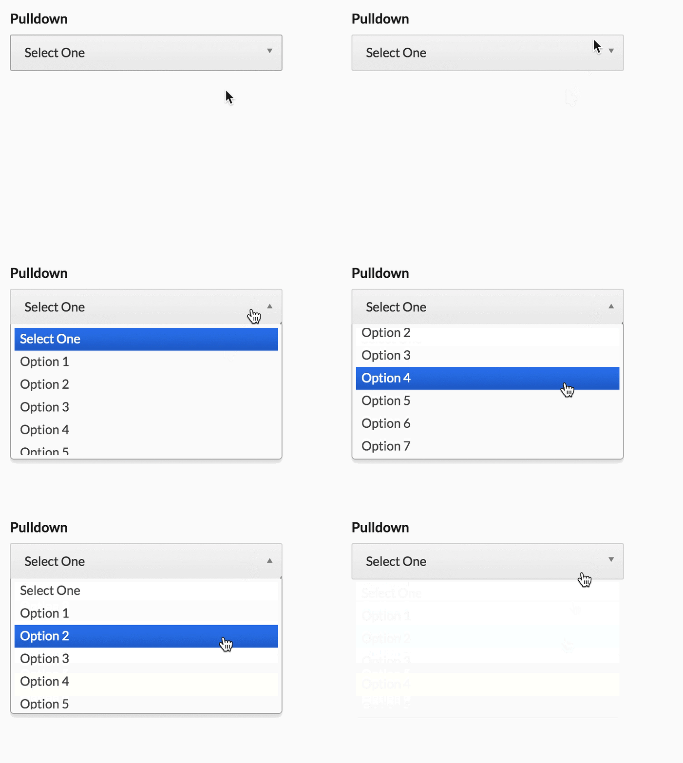
fae_radio f, :winefae_pulldown| option | type | default | description |
|---|---|---|---|
| collection | array or AR:Relation | AssociationClass.all | an array or ActiveRecord object of items to populate the element |
| size | 'long' or 'short' | long | determines the size of the pulldown |
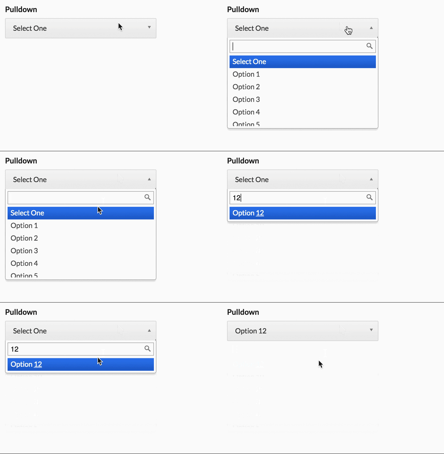
| search | boolean | search is displayed with more than 10 items | determines whether or not to show the search bar |
Examples
A short pulldown of a belongs_to association
fae_pulldown f, :wine, size: 'short', collection: Wine.order(:name)With search:
fae_multiselectassociations only
| option | type | default | description |
|---|---|---|---|
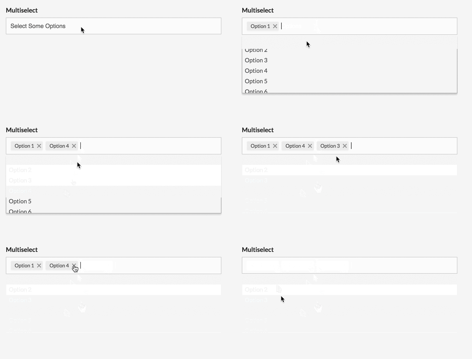
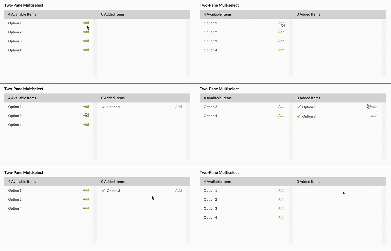
| two_pane | boolean | false | By default this will display a chosen style multiselect. Setting this to true will display the 'two pane' style. |
Examples
A chosen style multiselect with custom label_method
fae_multiselect f, :acclaims, label_method: :publicationA two pane style multiselect
fae_multiselect f, :selling_points, two_pane: truefae_grouped_select| option | type | default | description |
|---|---|---|---|
| collection | array or AR:Relation | AssociationClass.all | an array or ActiveRecord object of items to populate the element |
| groups | array of strings | must be used with labels | |
| labels | array of strings | must be used with groups |
fae_datepickerattributes only
Examples
fae_datepicker f, :release_datefae_daterangepickerattributes only
The daterangepicker is a little different: instead of a single attribute, it accepts an array of two attributes.
Examples
fae_daterange f, [:start_date, :end_date], label: 'Start/End dates'The color picker includes alpha support but can be disabled by setting alpha: false
fae_color_picker f, :colorfae_prefixattributes only
| option | type | default | description |
|---|---|---|---|
| prefix | string | (required) string will appear in prefix box | |
| icon | boolean | false | determines whether or not to display prefix icon |
Examples
fae_prefix f, :price, prefix: '$', placeholder: '50.00'fae_suffixattributes only
| option | type | default | description |
|---|---|---|---|
| suffix | string | (required) string will appear in suffix box | |
| icon | boolean | false | determines whether or not to display prefix icon |
Examples
fae_suffix f, :weight, suffix: 'lbs'fae_video_urlattributes only
This helper is a normal fae_input, but provides a custom helper and hint specific to extracting YouTube IDs.
Examples
fae_video_url f, :video_url

