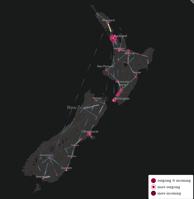
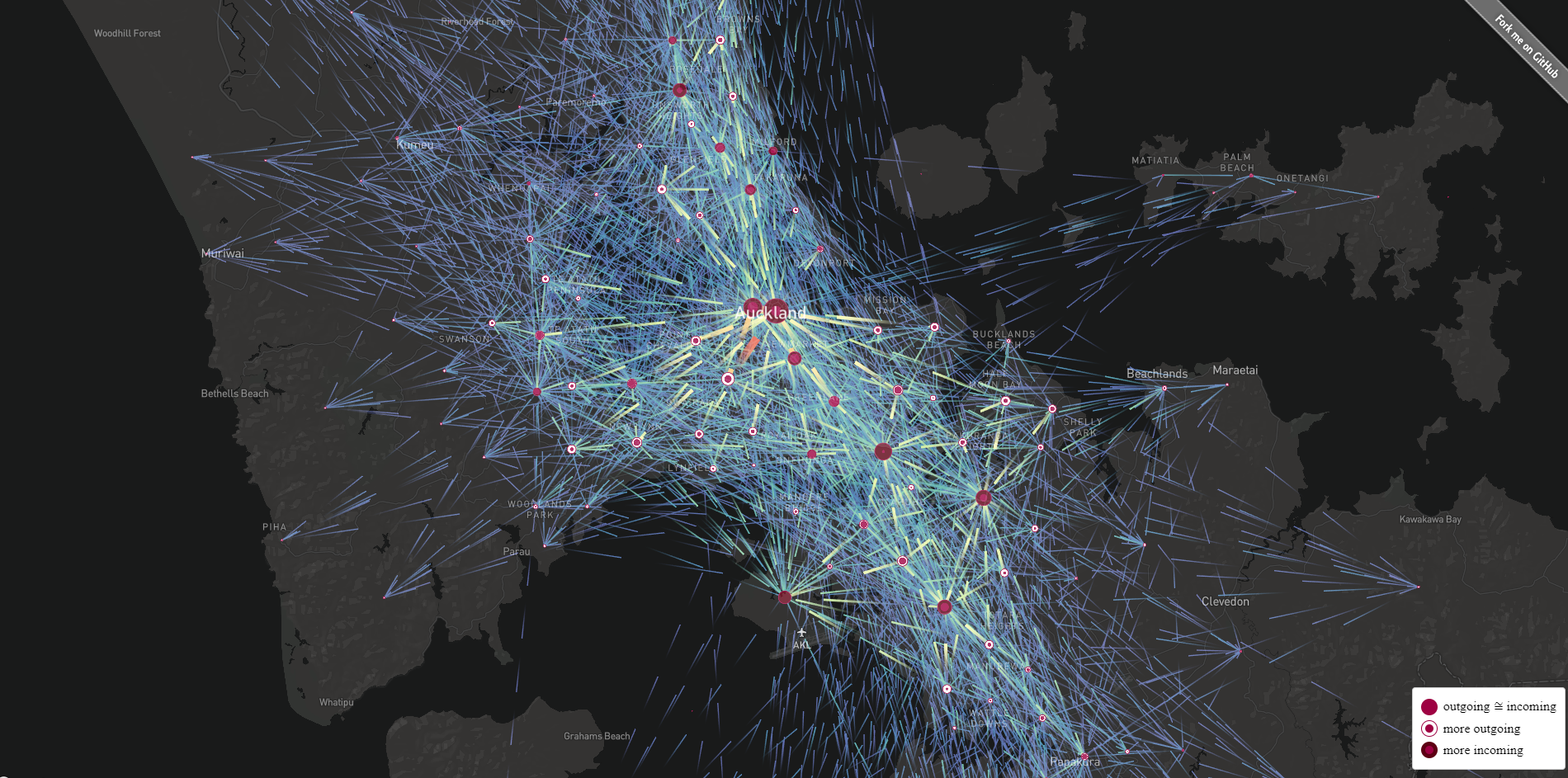
Visualisation of the 2018 NZ Census commuter data.
This is a flowmap using using flowmap.gl. The app was bootstrapped with Create React App.
First, clone the repository:
git clone [email protected]:neon-ninja/TABA.git
Then install dependencies:
cd TABA
yarn install
Add .env file to the project root with a Mapbox access token:
REACT_APP_MapboxAccessToken=Your_Own_Mapbox_Access_Token_Goes_Here
Finally, run:
yarn start
This visualises the "2018 Census Main means of travel to work by Statistical Area 2" dataset using a flowmap. Only the "total" column is used. The data was preprocessed with QGIS to optimise file size for load time and reprojected to WGS84. Animated lines flow from the home SA2 true centroid to the work SA2 true centroid. The circles and lines are sized and coloured based on the number of people commuting along each path. The user can hover over a circle to highlight flows in or out of that point. Additionally, points are dynamically clustered depending on zoom level. I chose to show all lines at the same time to reduce the amount of user interaction required to show patterns.