Backpack React Native text component.
| Day | Night |
|---|---|
 |
 |
 |
 |
| Day | Night |
|---|---|
 |
 |
 |
 |
| Day | Night |
|---|---|
 |
 |
 |
 |
Check the main Readme for a complete installation guide.
Note: If rendering emoji, please wrap them in
BpkEmojias this will preserve the correct line height when using a custom font.
import React, { Component } from 'react';
import { View, StyleSheet } from 'react-native';
import BpkText, {
BpkEmoji,
WEIGHT_STYLES,
} from 'backpack-react-native/bpk-component-text';
import { spacingBase } from '@skyscanner/bpk-foundations-react-native/tokens/base.react.native';
const styles = StyleSheet.create({
container: {
flex: 1,
justifyContent: 'center',
padding: spacingBase,
}
});
export default class App extends Component {
render() {
return (
<View style={styles.container}>
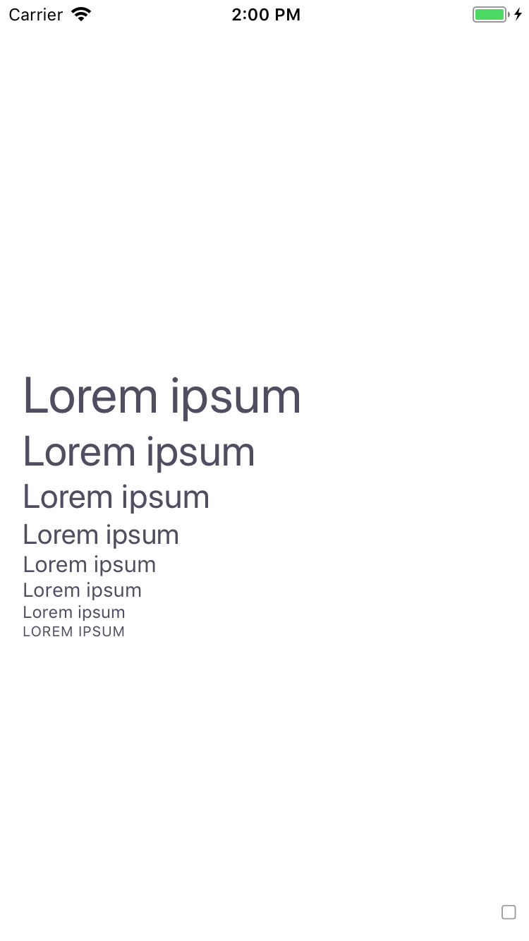
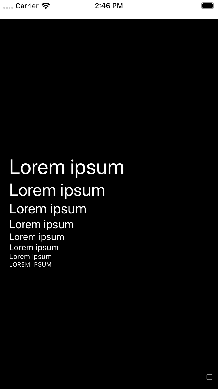
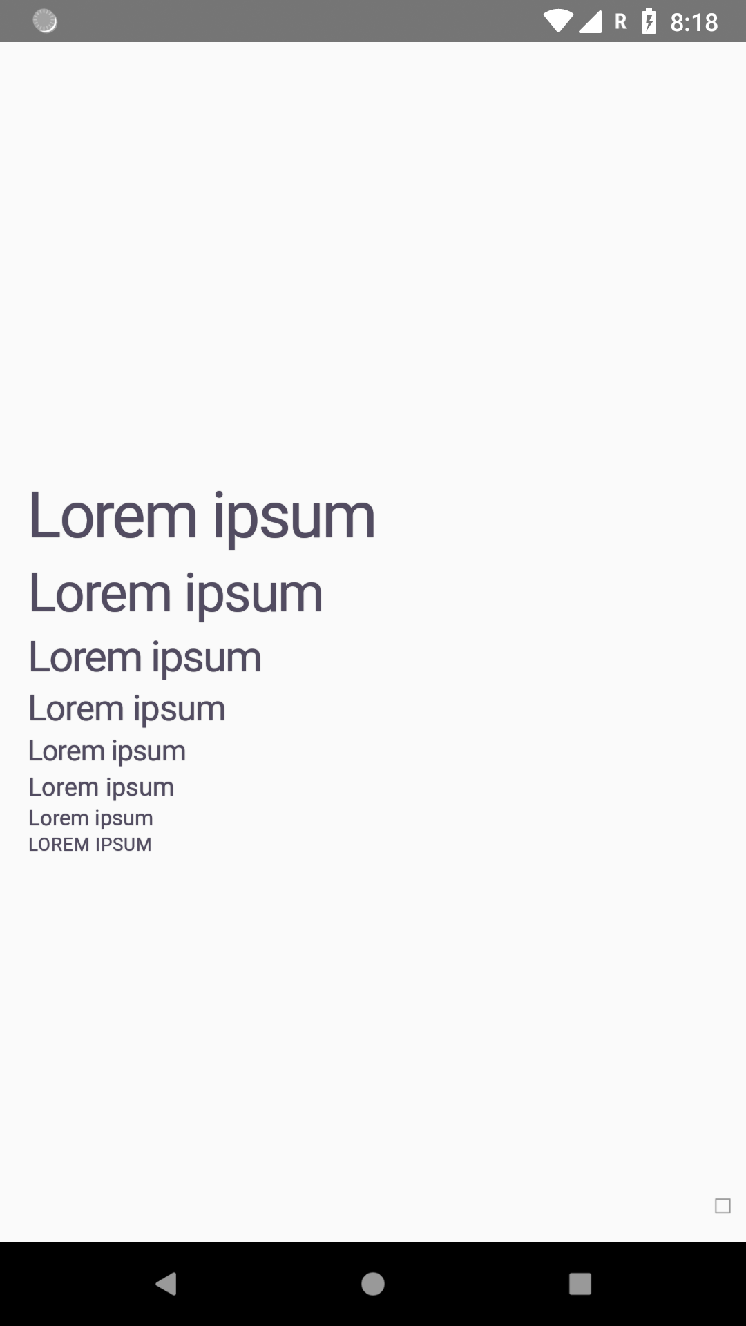
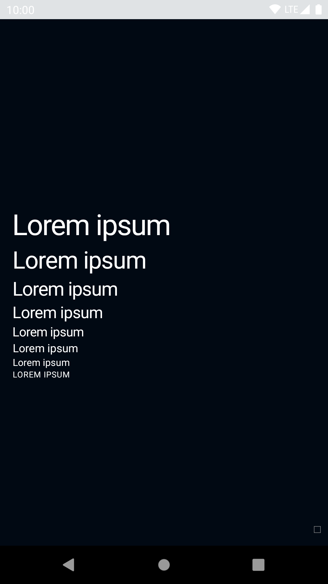
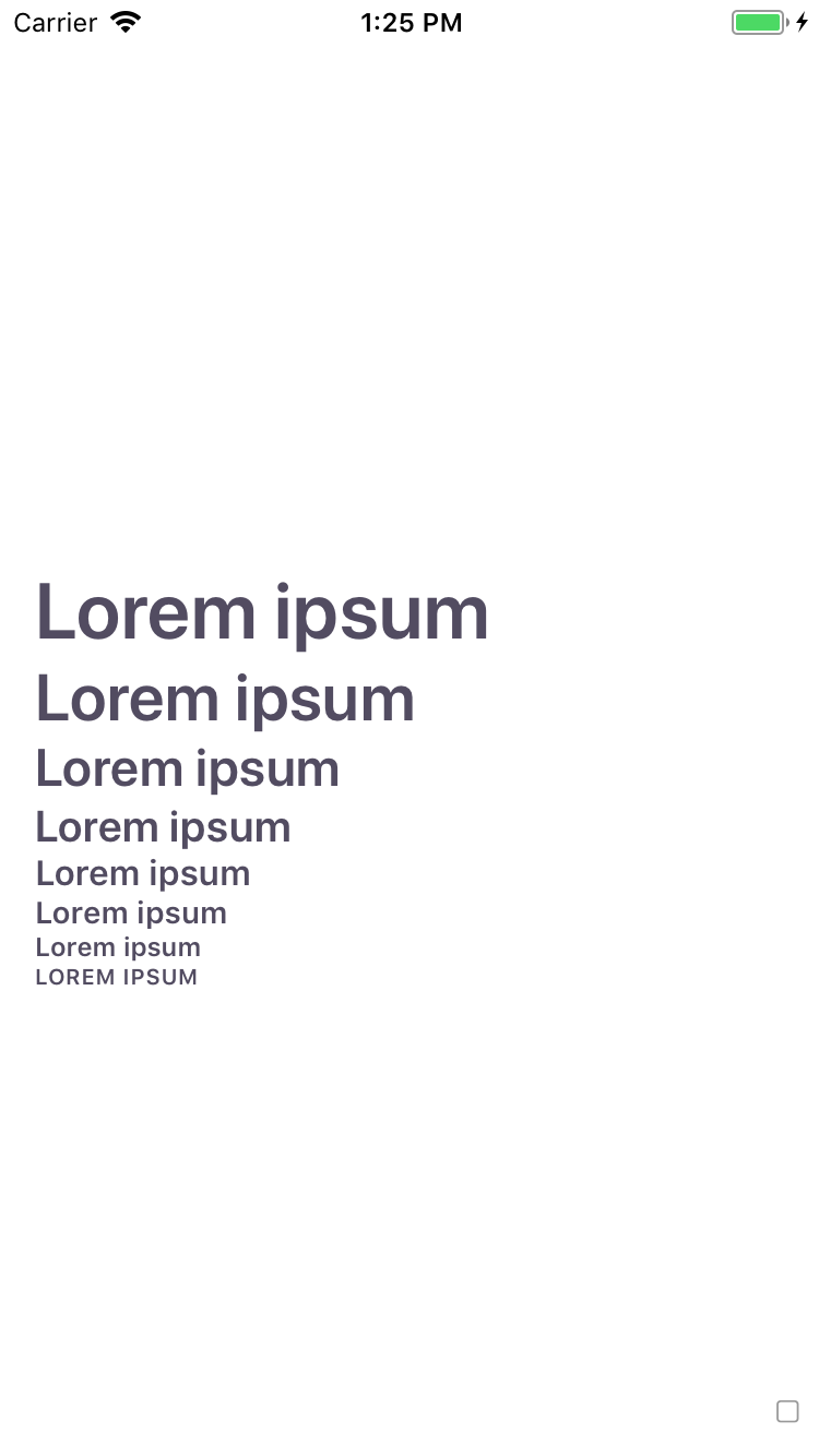
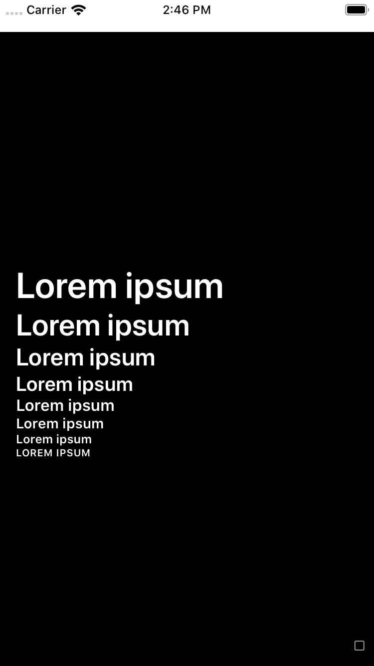
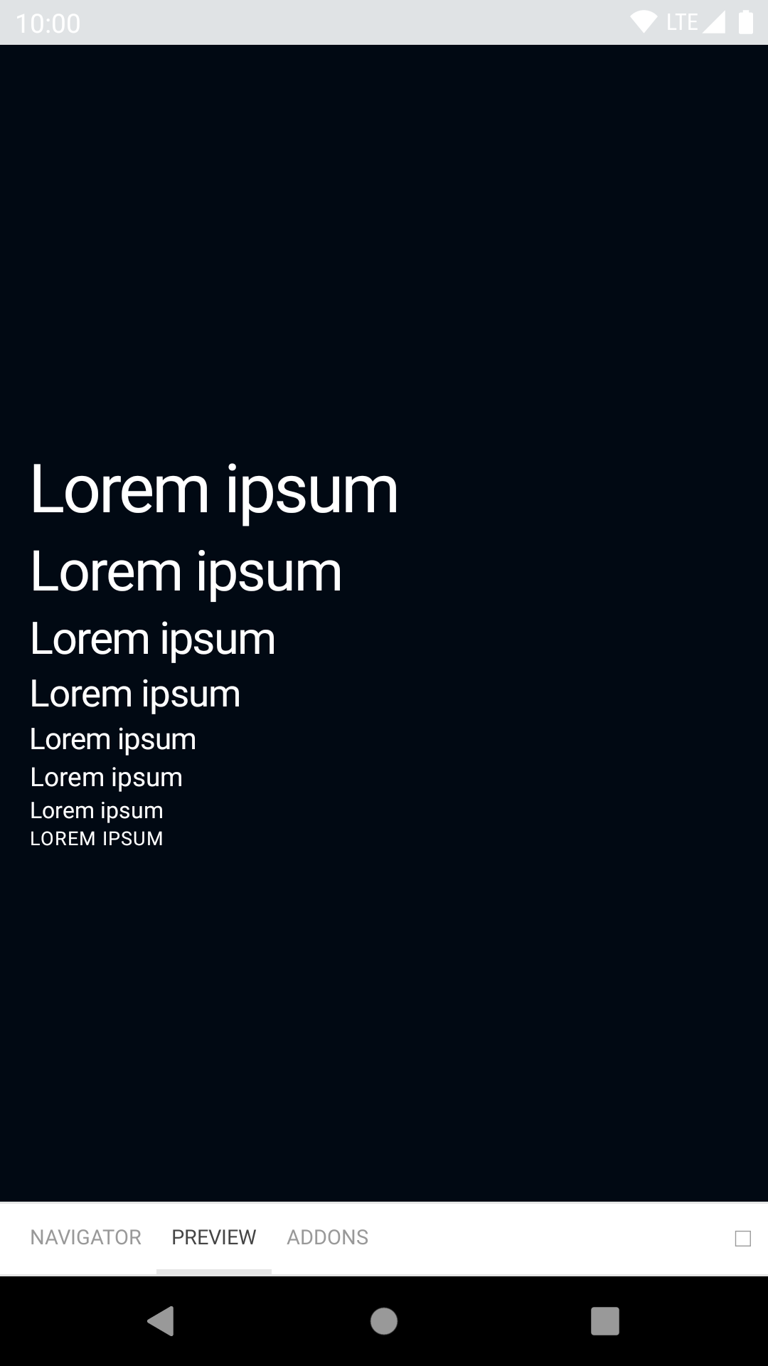
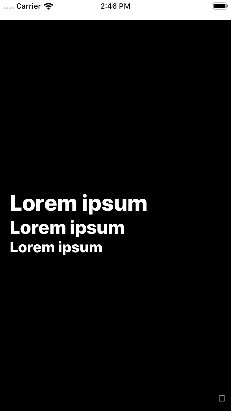
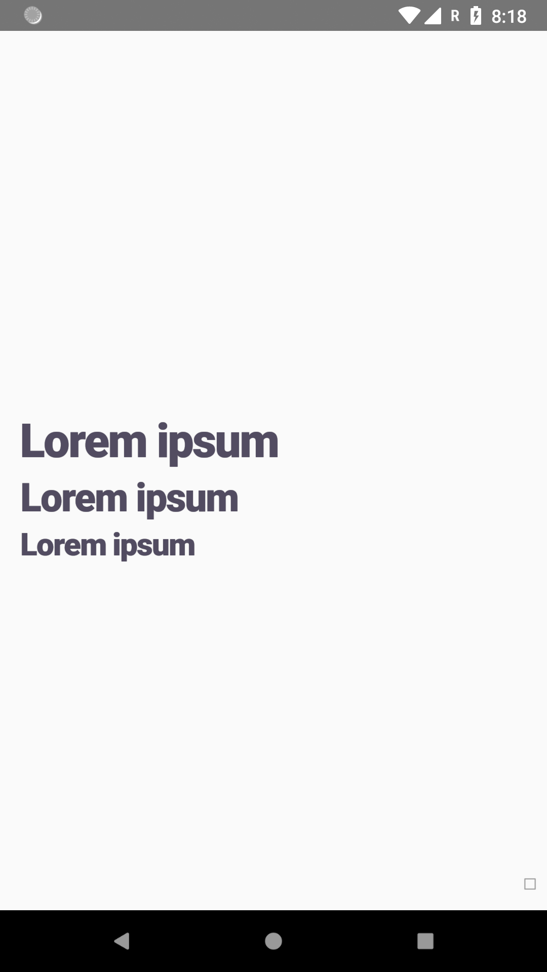
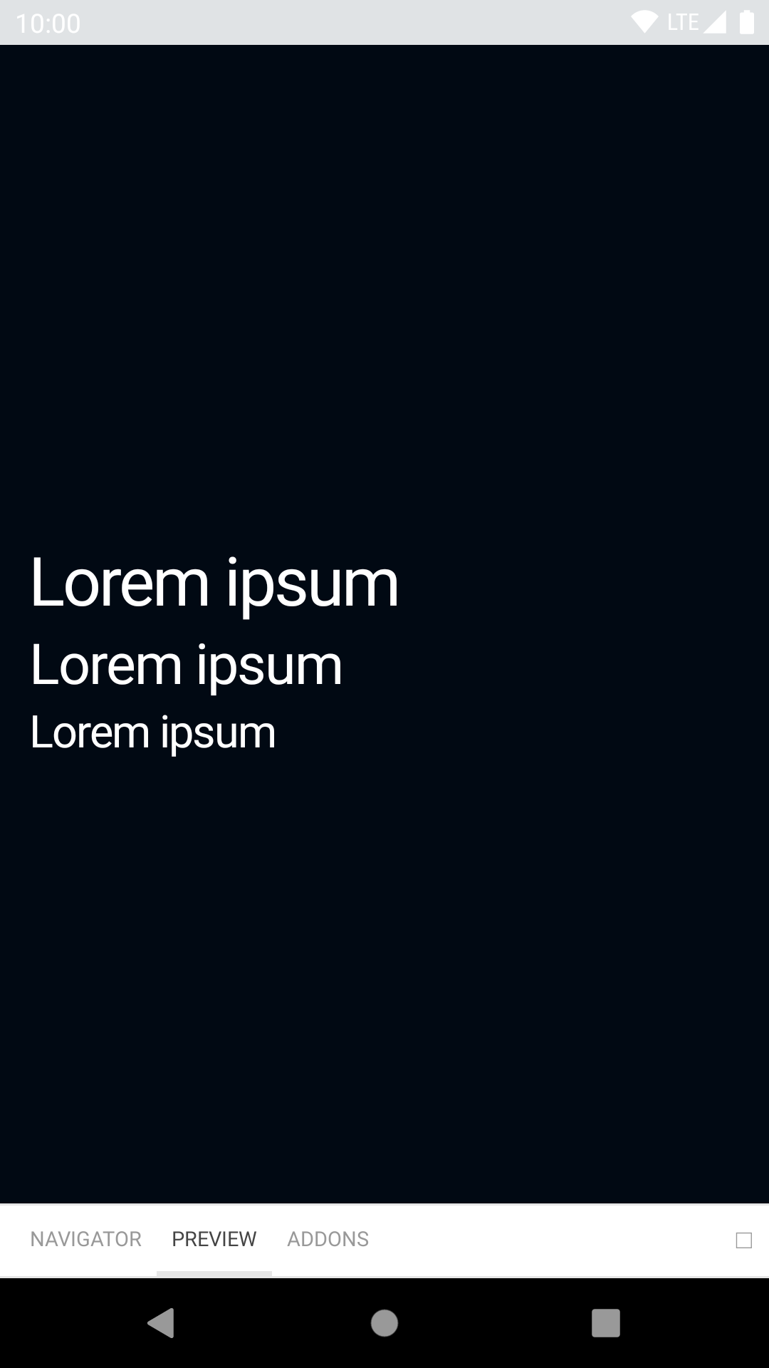
<BpkText textStyle='xxl'>Backpack rocks!</BpkText>
<BpkText textStyle='xl' weight={WEIGHT_STYLES.heavy}>Backpack rocks!</BpkText>
<BpkText textStyle='lg' weight={WEIGHT_STYLES.emphasized}>Backpack rocks!</BpkText>
<BpkText textStyle='base'>Backpack rocks!</BpkText>
<BpkText textStyle='sm'>Backpack rocks!</BpkText>
<BpkText textStyle='xs'>Backpack rocks!</BpkText>
<BpkText textStyle='caps'>BACKPACK ROCKS!</BpkText>
<BpkText textStyle="caps">BACKPACK ROCKS! <BpkEmoji>🎉</BpkEmoji></BpkText>
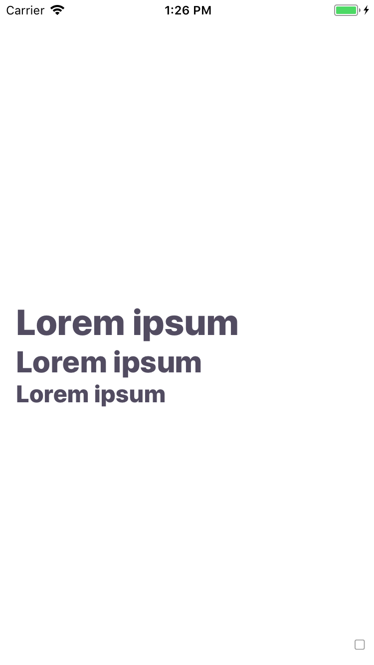
<BpkText textStyle='lg'>
<BpkText textStyle='inherit' weight='emphasized'>Backpack</BpkText> rocks!
</BpkText>
</View>
);
}
}| Property | PropType | Required | Default Value |
|---|---|---|---|
| children | node | true | - |
| textStyle | oneOf('xxl', 'xl', 'lg', 'base', 'sm', 'xs', 'caps', 'inherit') | false | base |
| weight | oneOf('regular', 'emphasized', 'heavy') | false | regular |
emphasize (deprecated, use weight) |
bool | false | false |
textFontFamily
NOTE: For Android we expect font names to follow a specific name convention for bold and heavy variations. E.g. if you provide a font called myFont to the textFontFamilytheme attribute, we expect two more fonts to be available, those are myFont_bold and myFont_black.