Skip to content

Latest commit


History

History

bpk-component-button

Folders and files

NameName
Last commit message
Last commit date

parent directory

..


bpk-component-button

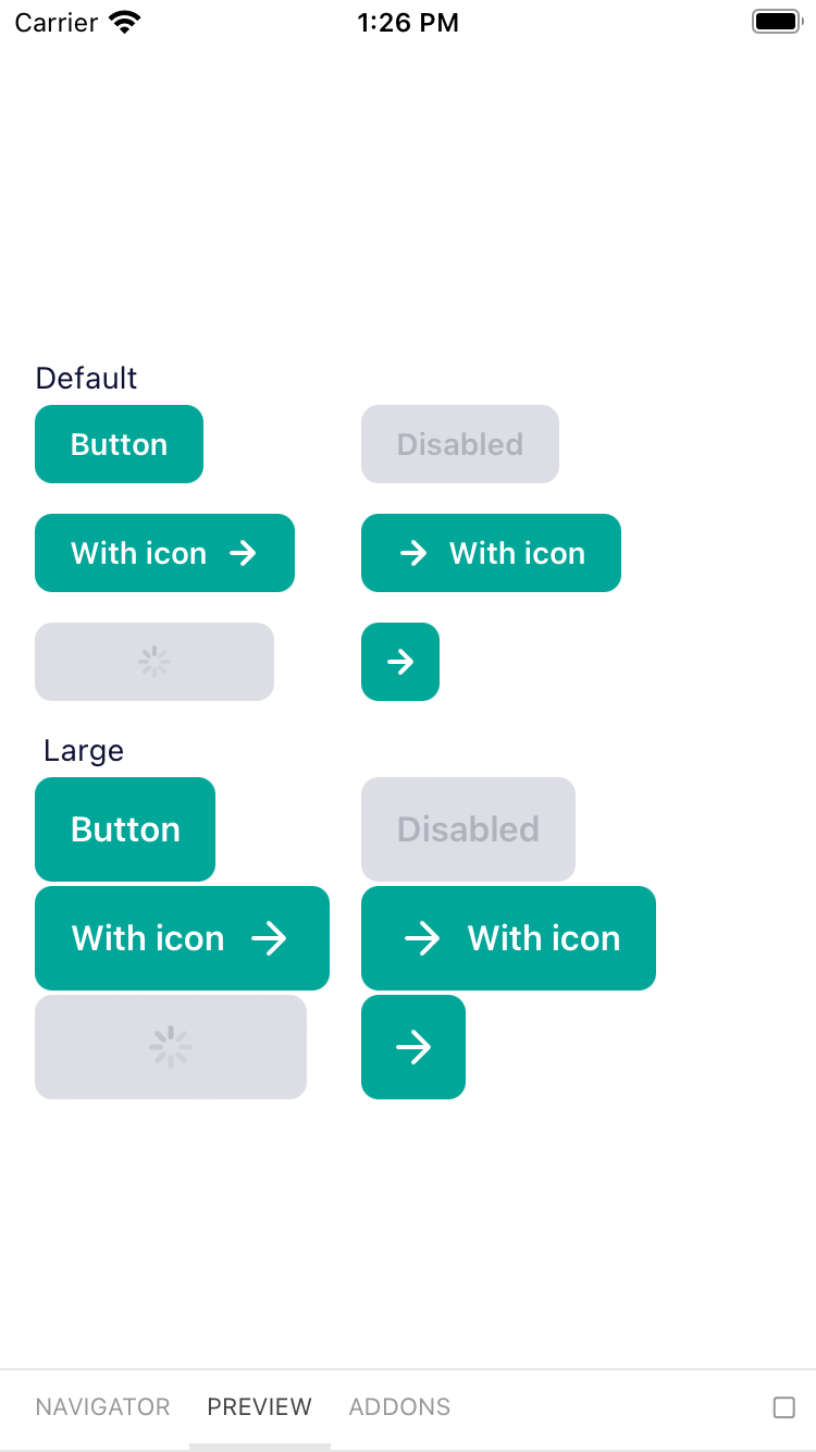
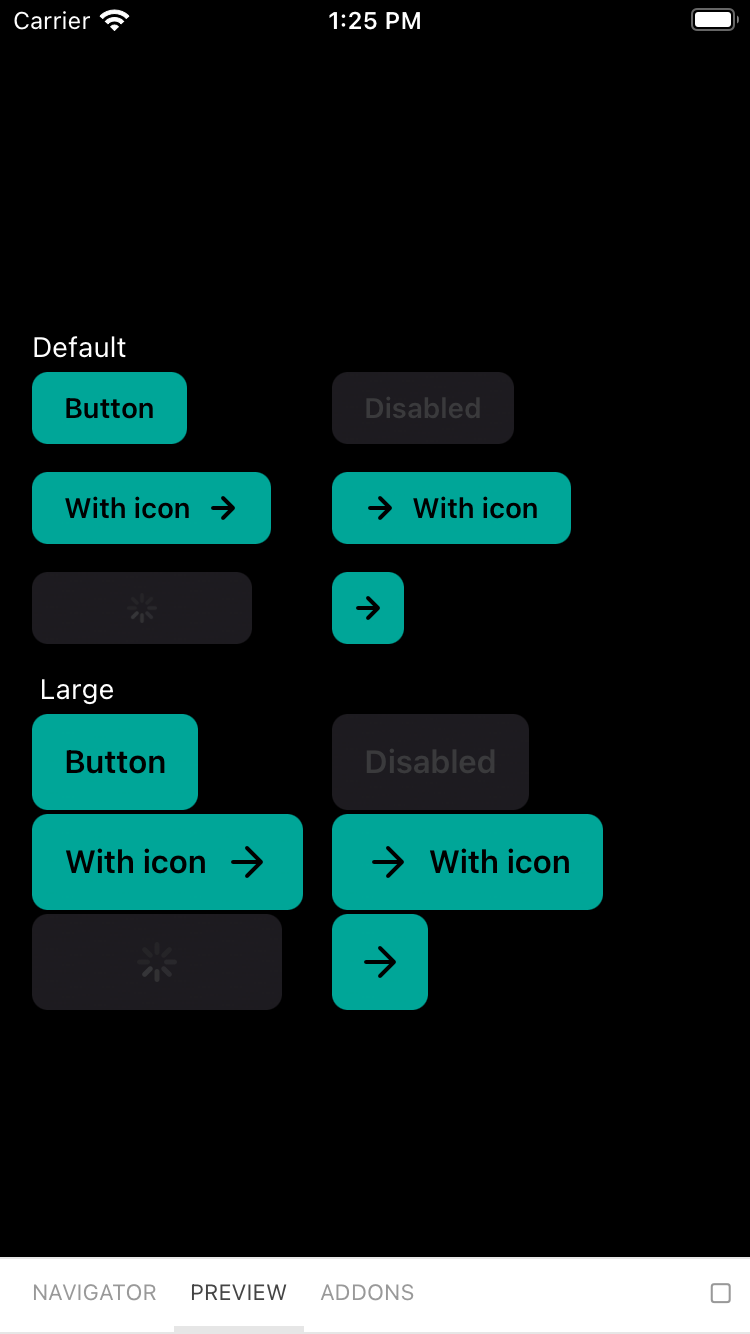
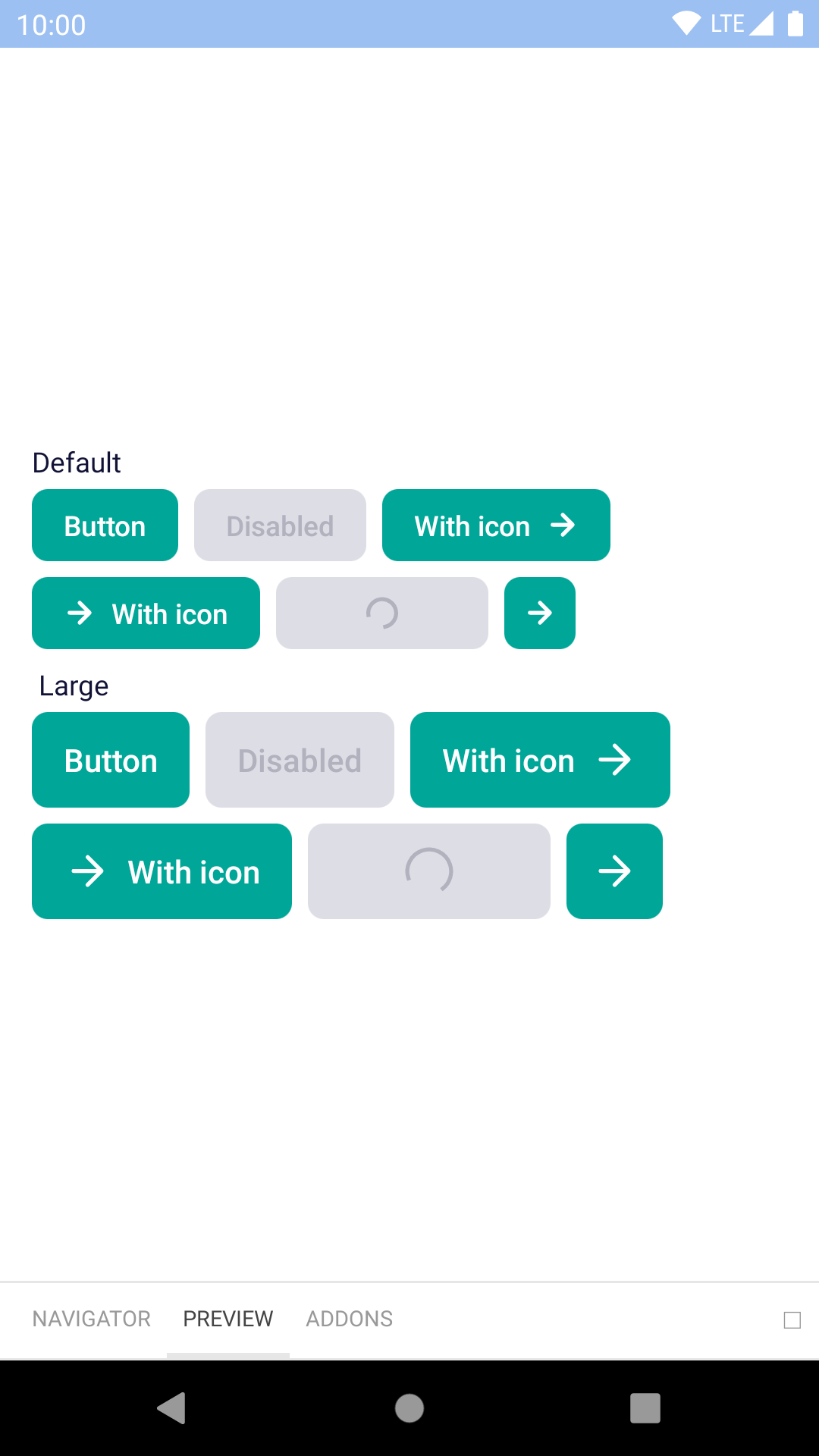
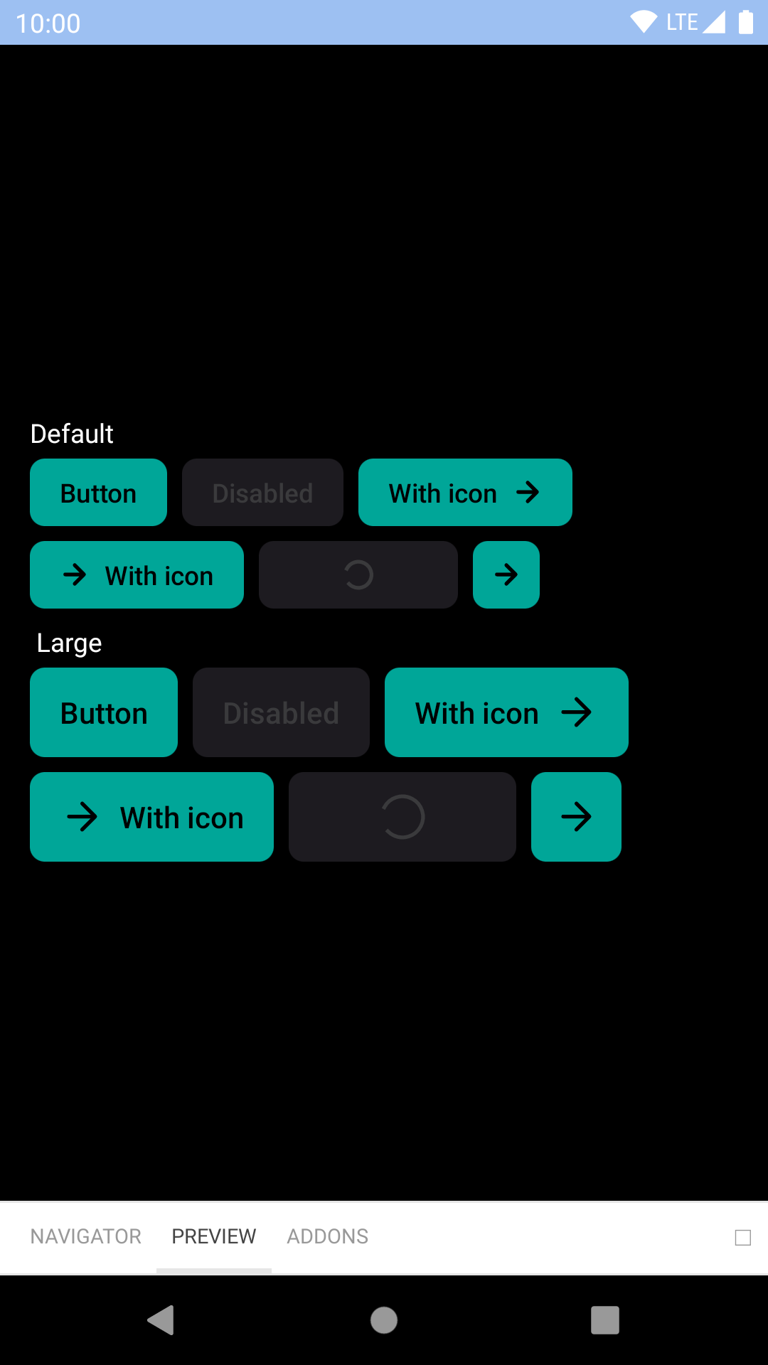
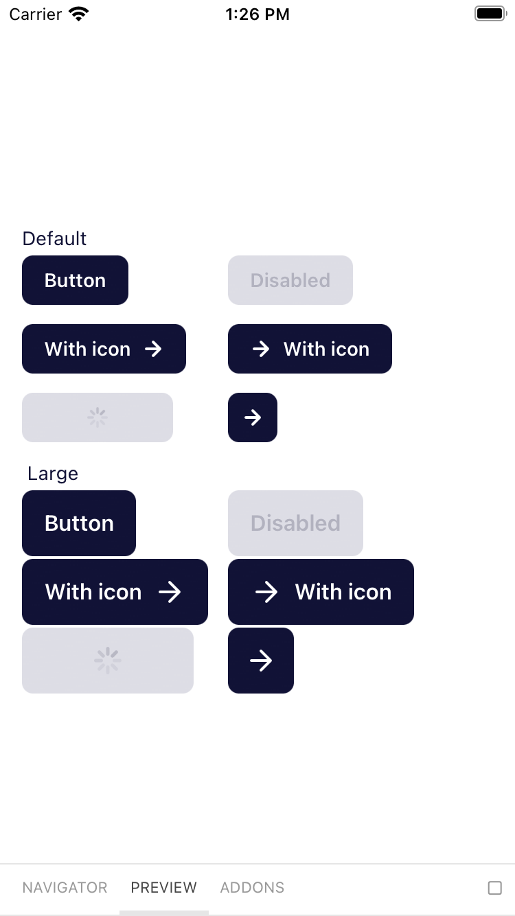
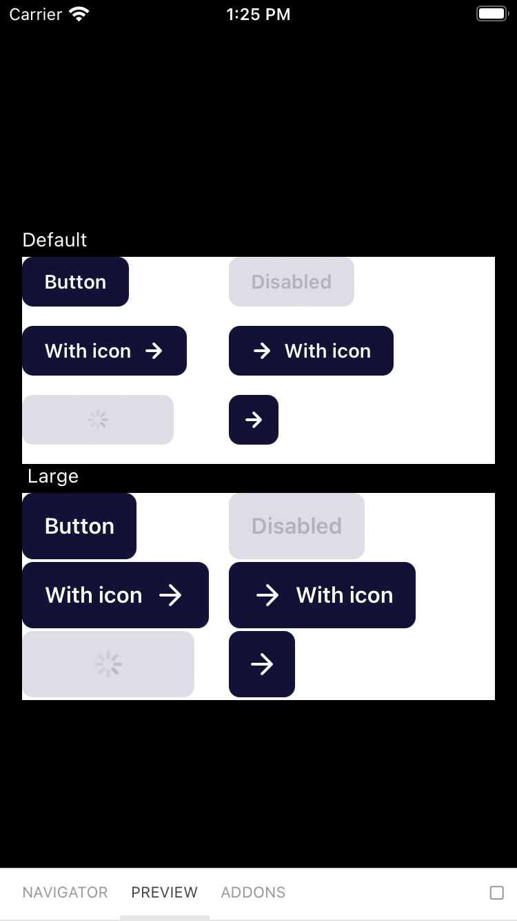
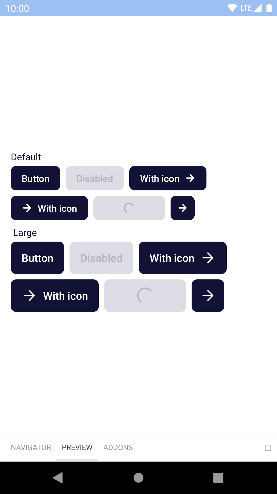
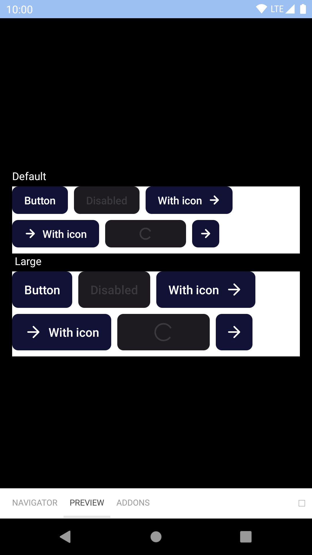
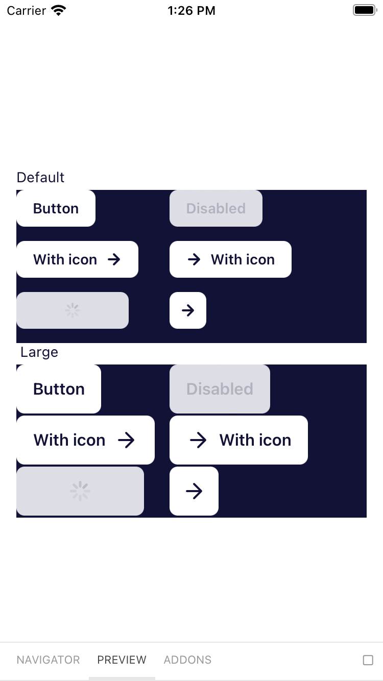
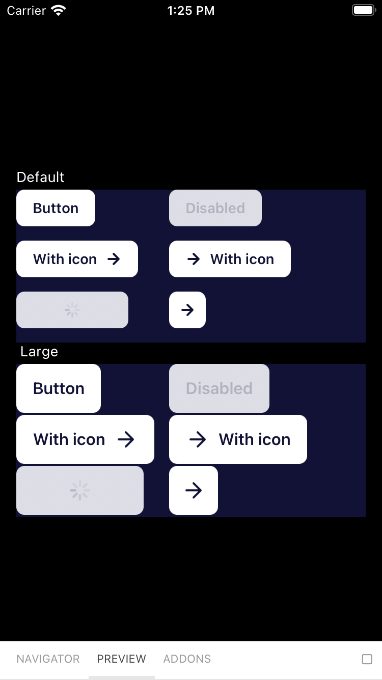
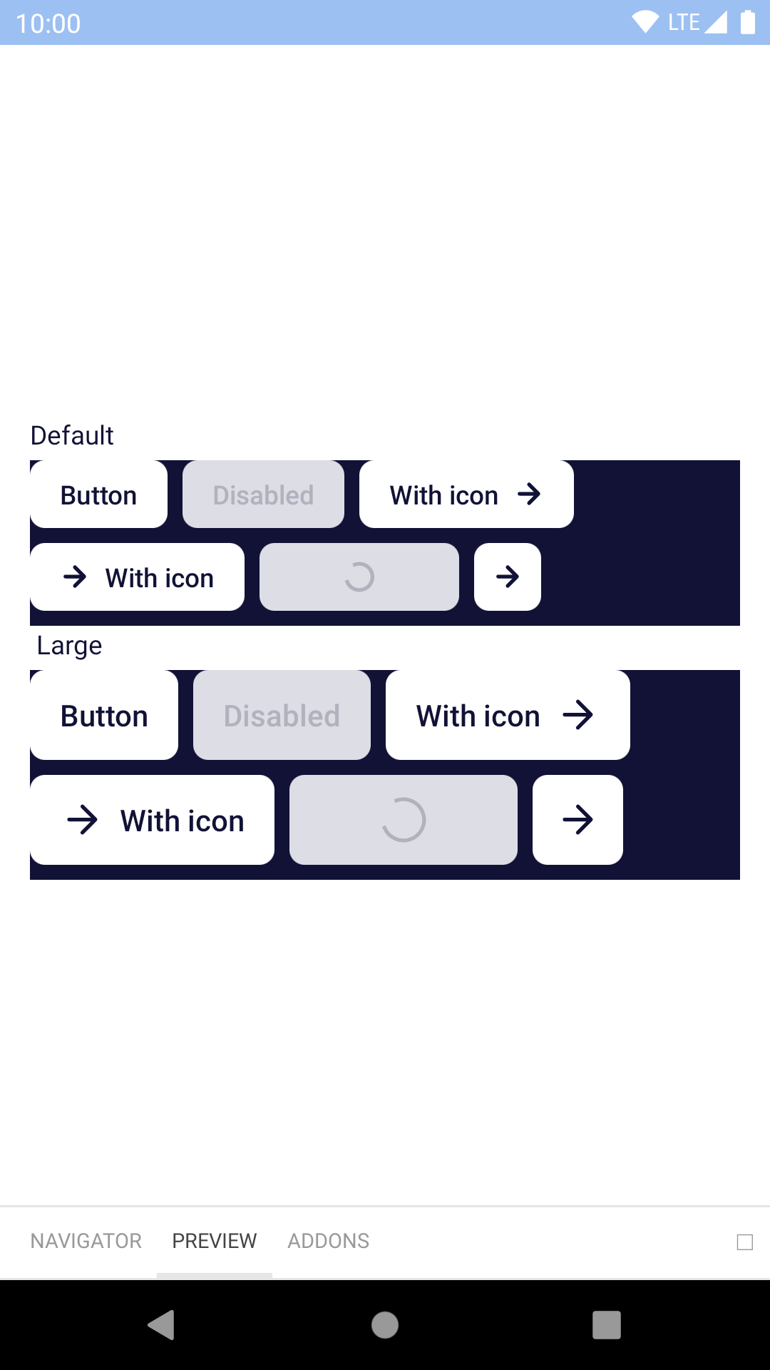
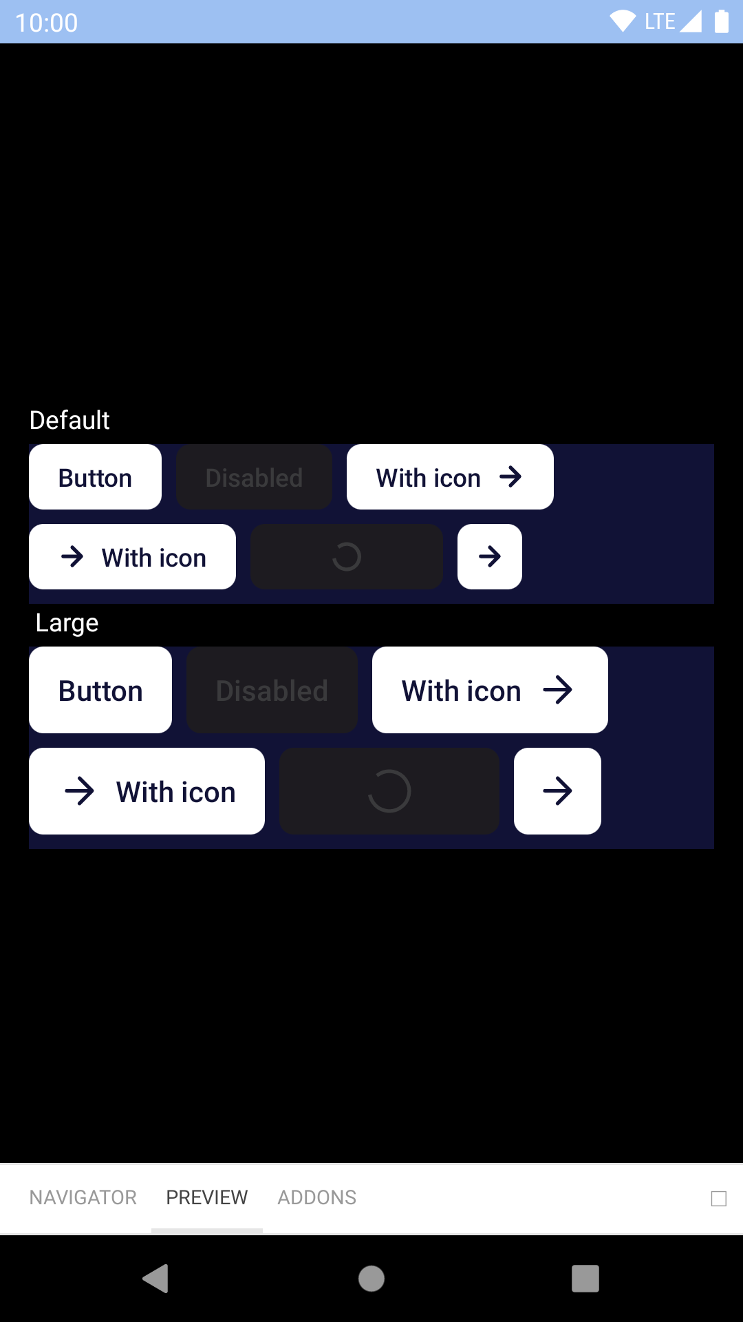
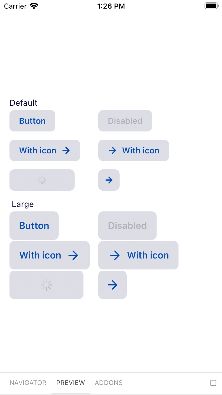
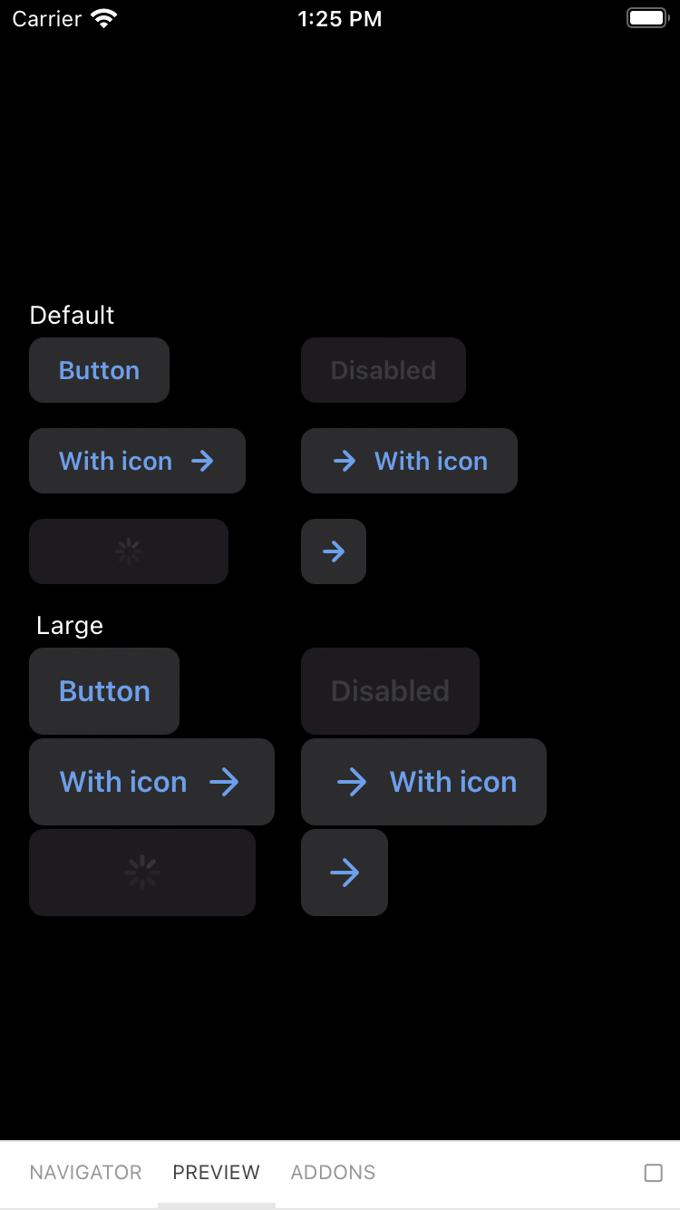
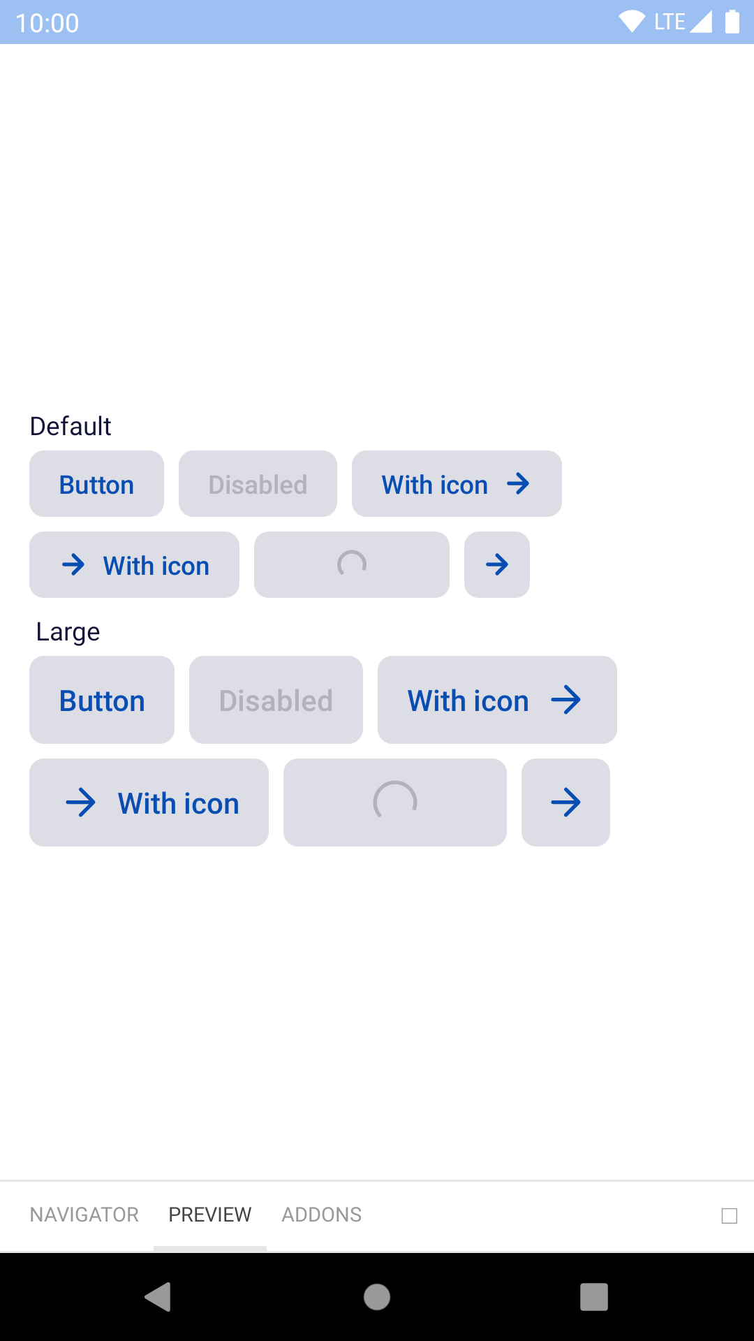
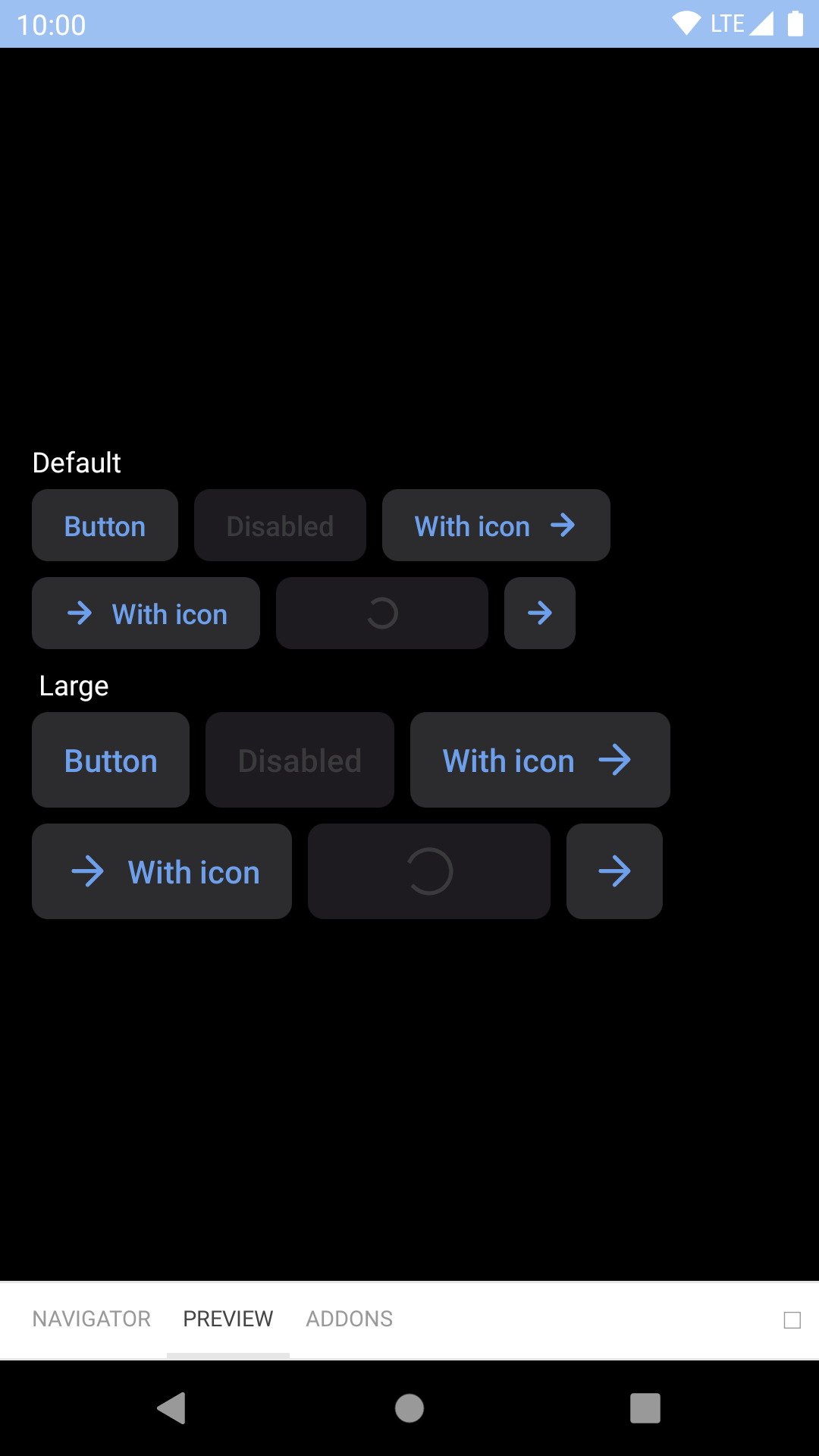
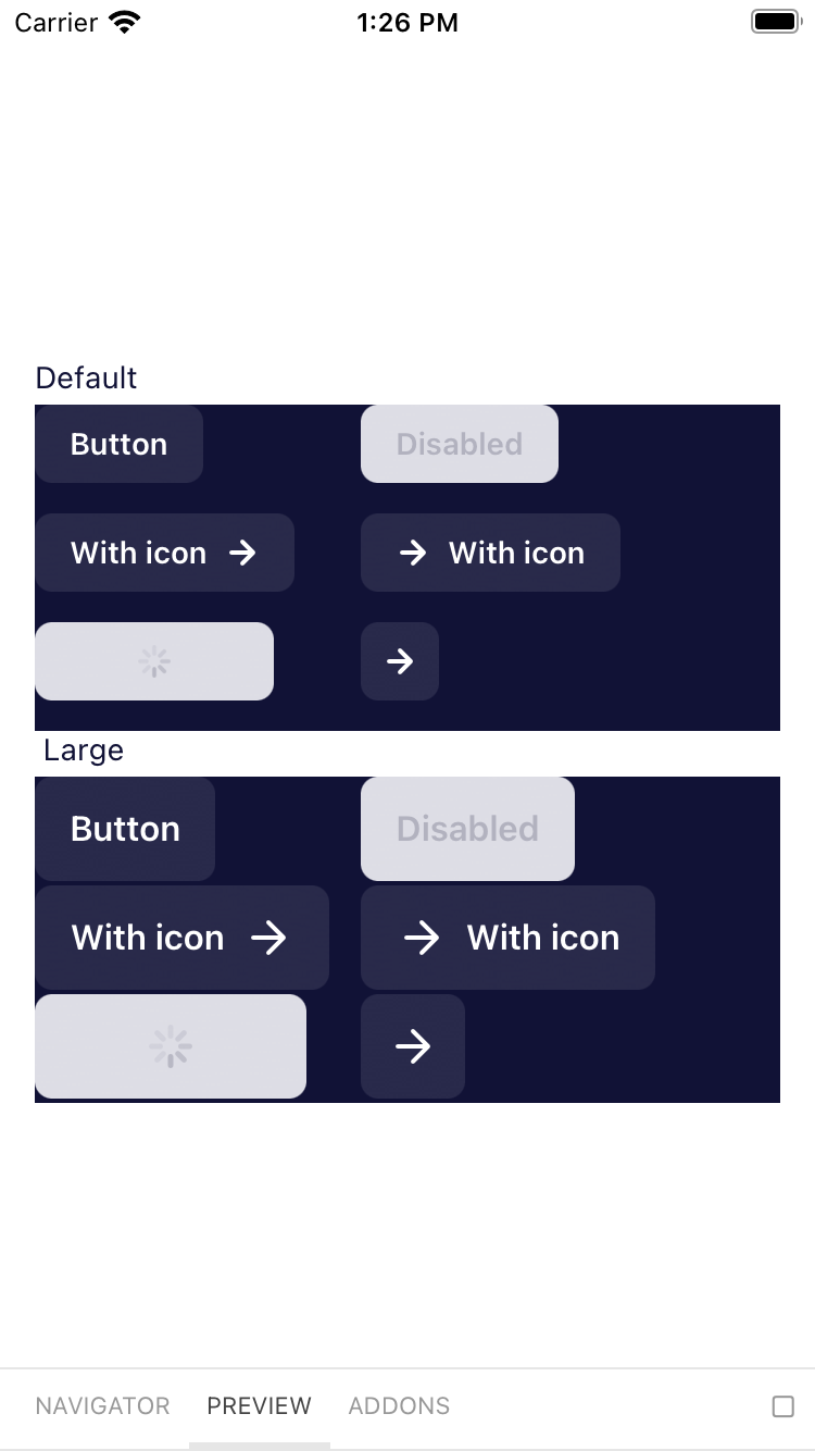
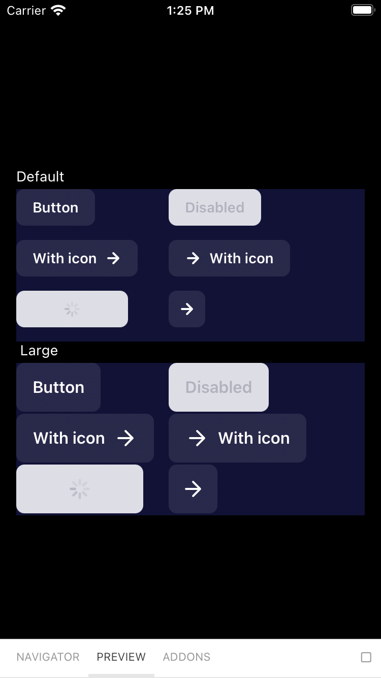
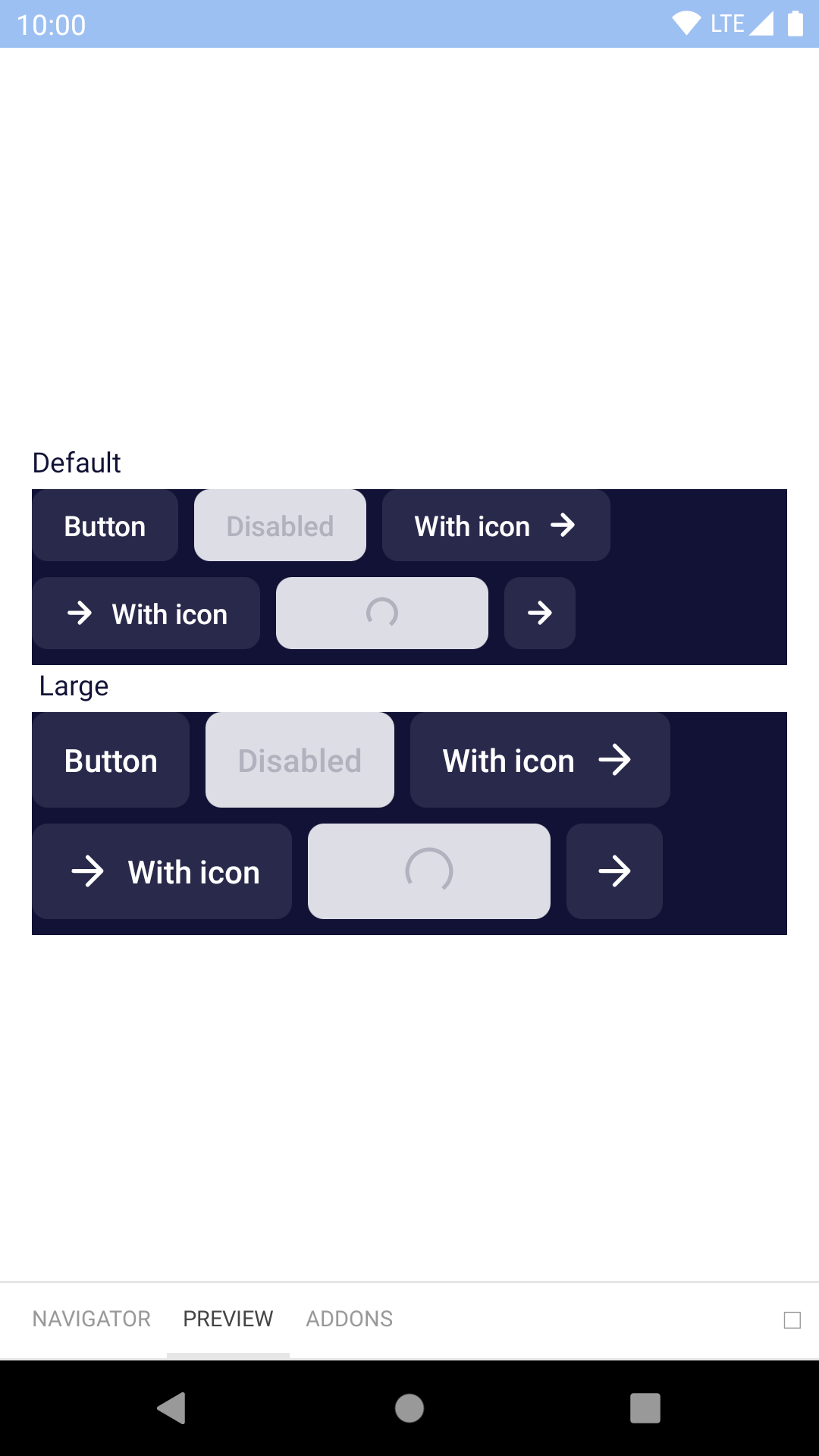
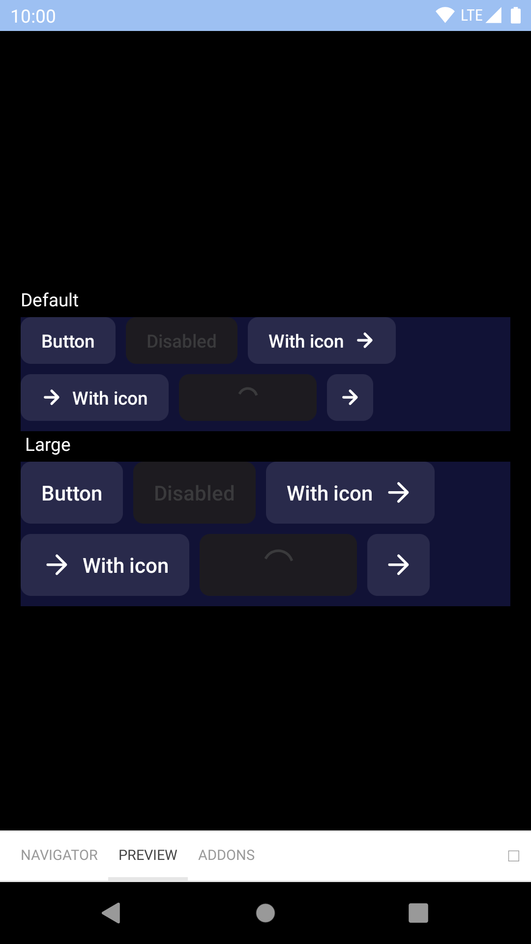
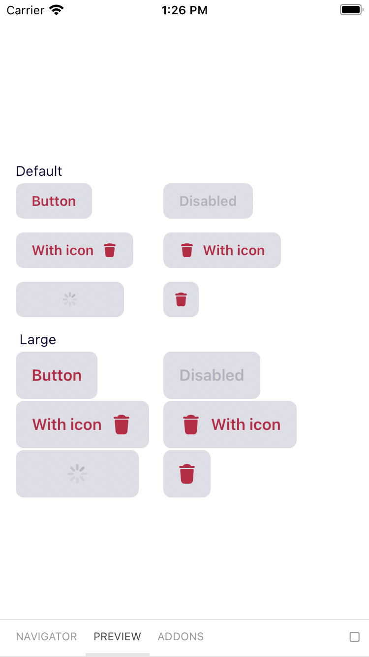
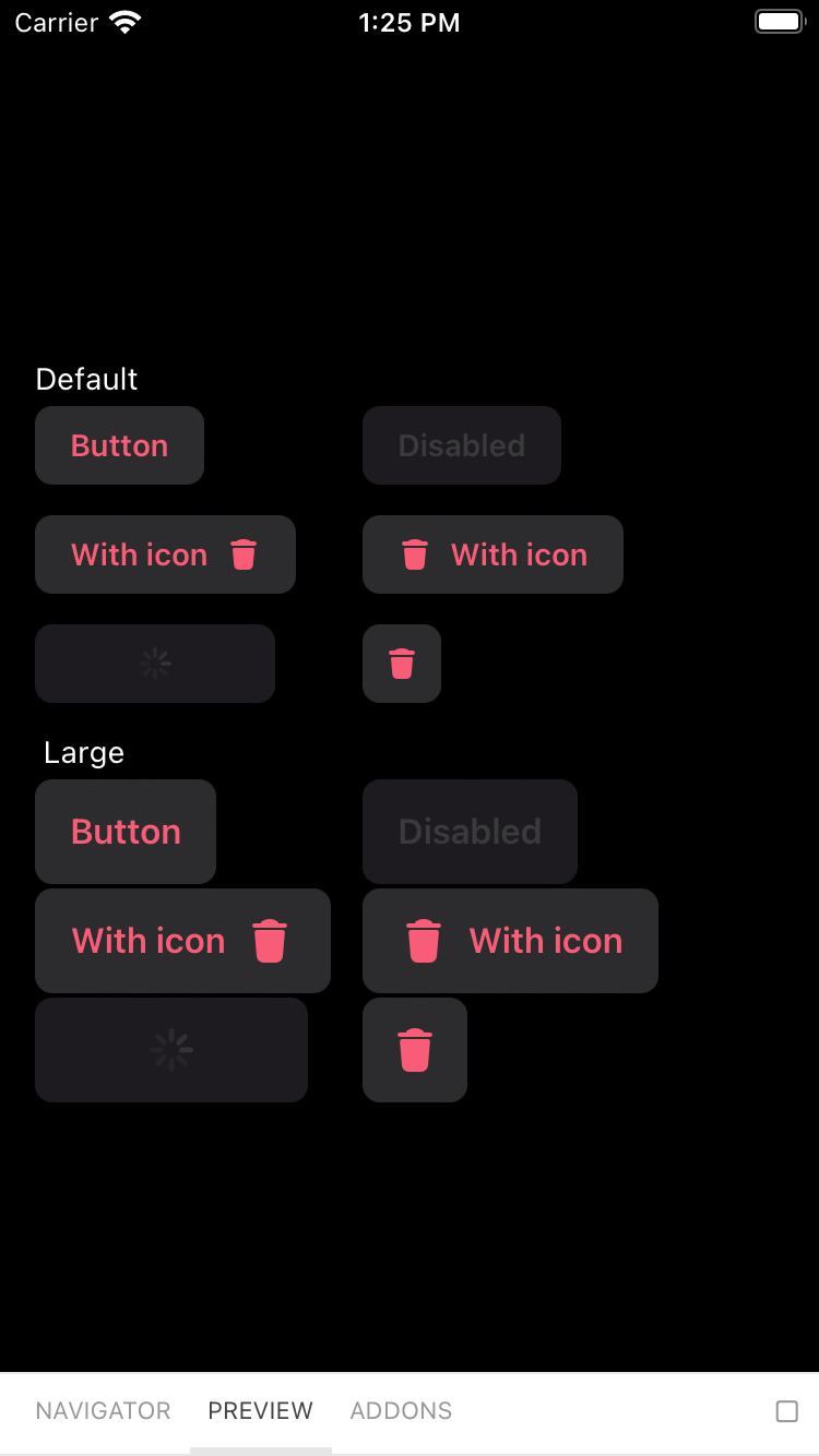
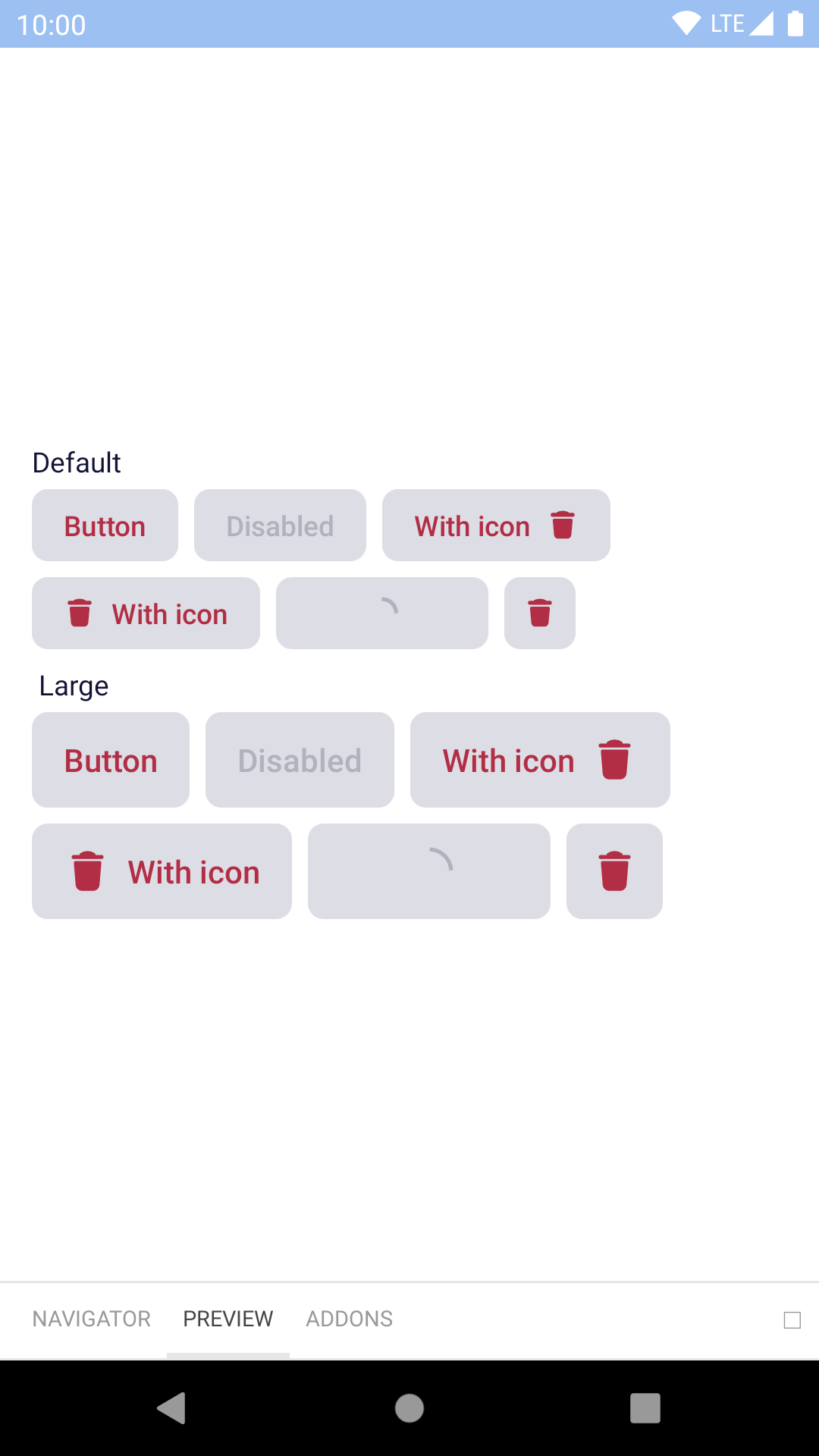
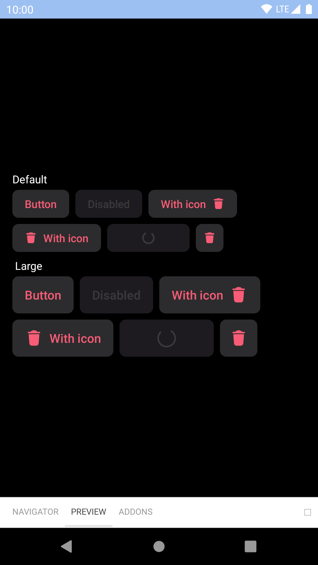
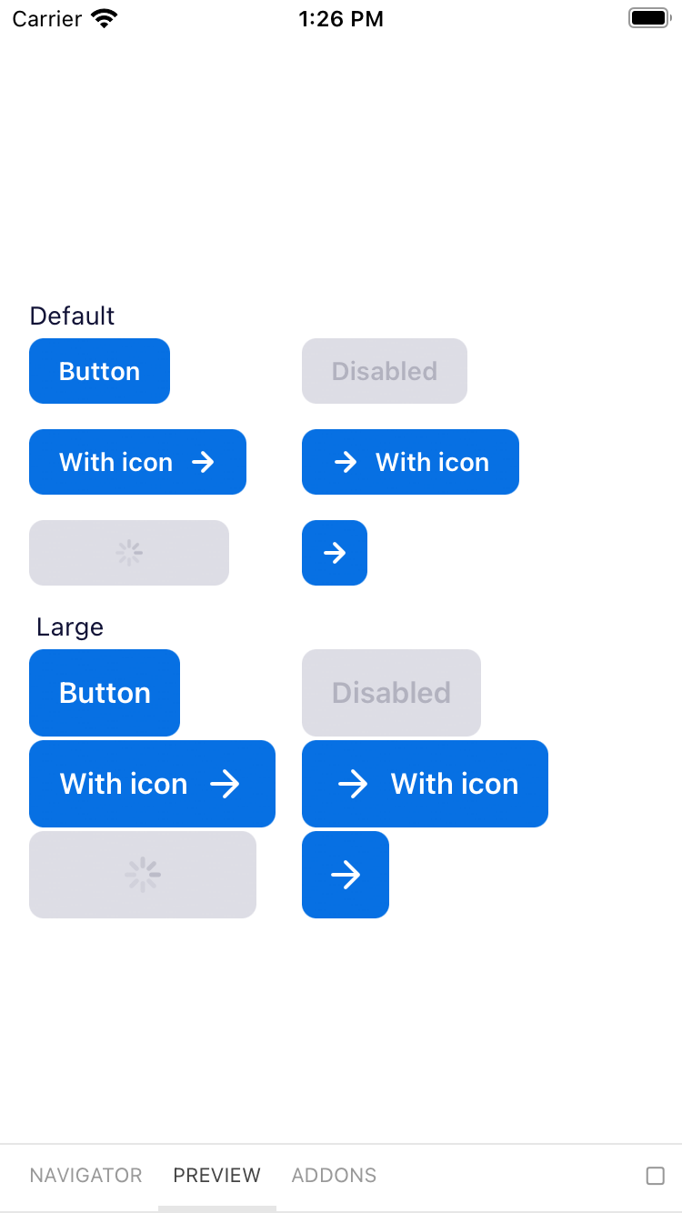
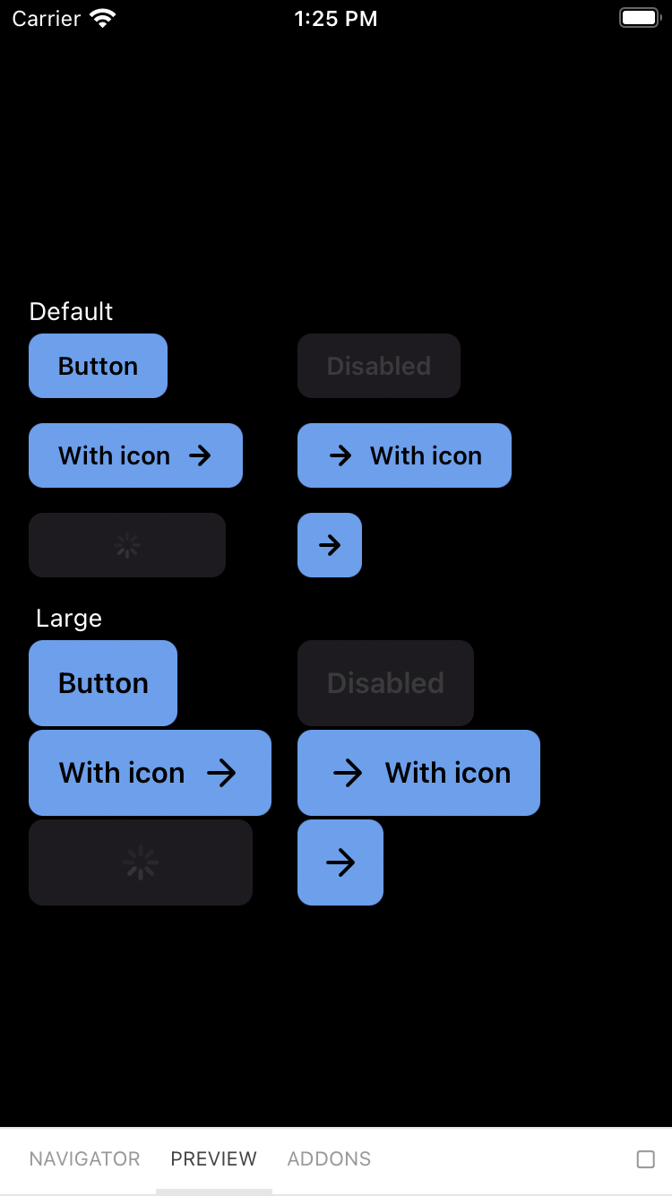
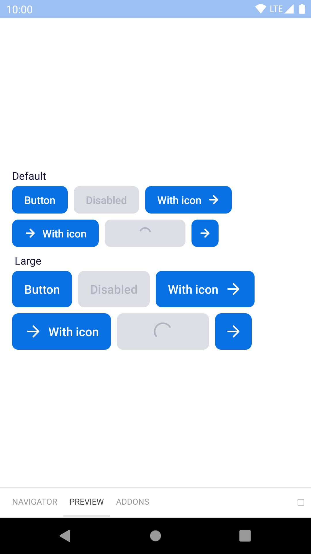
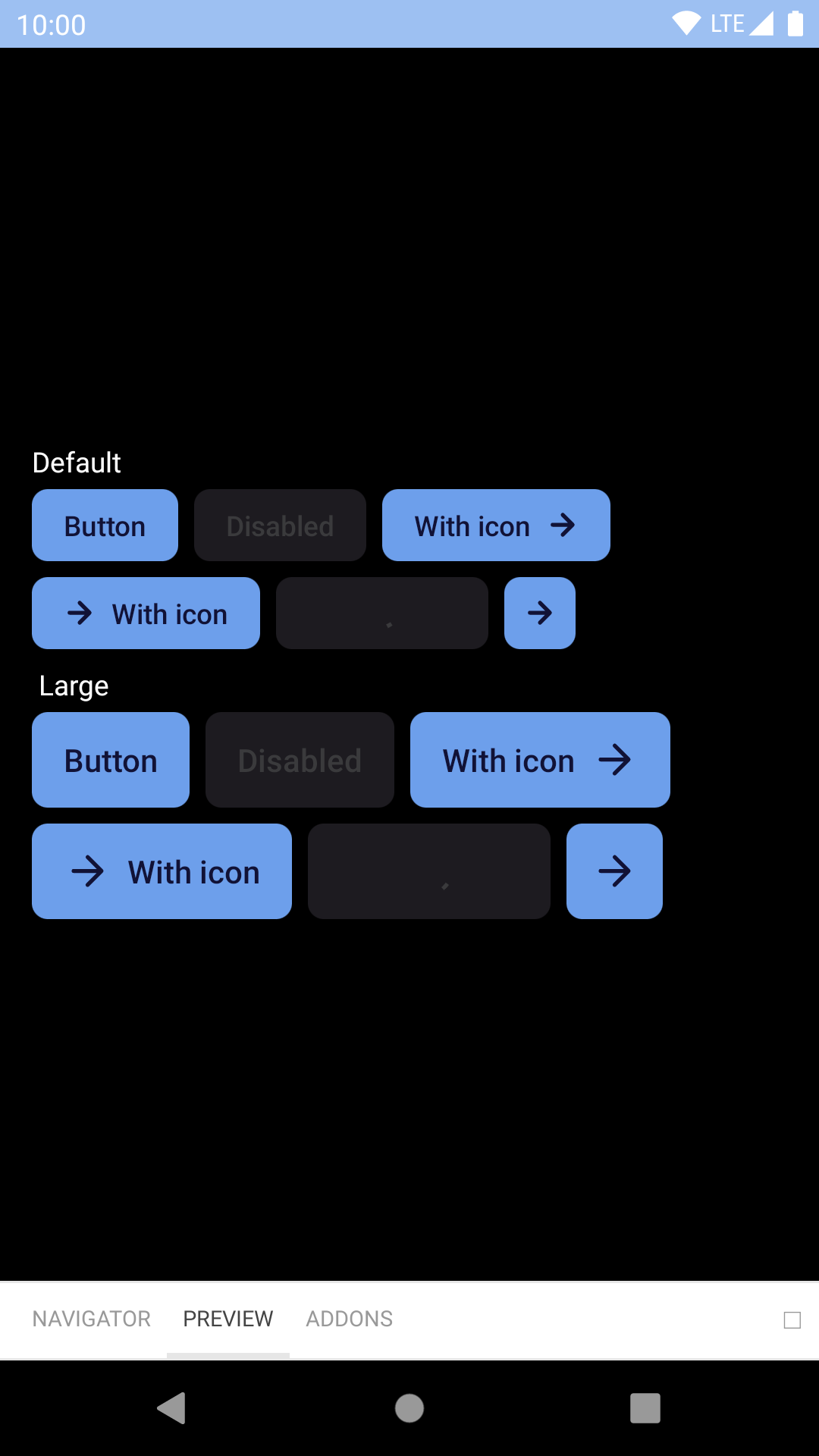
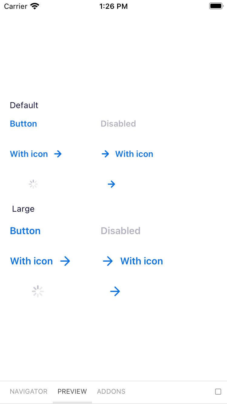
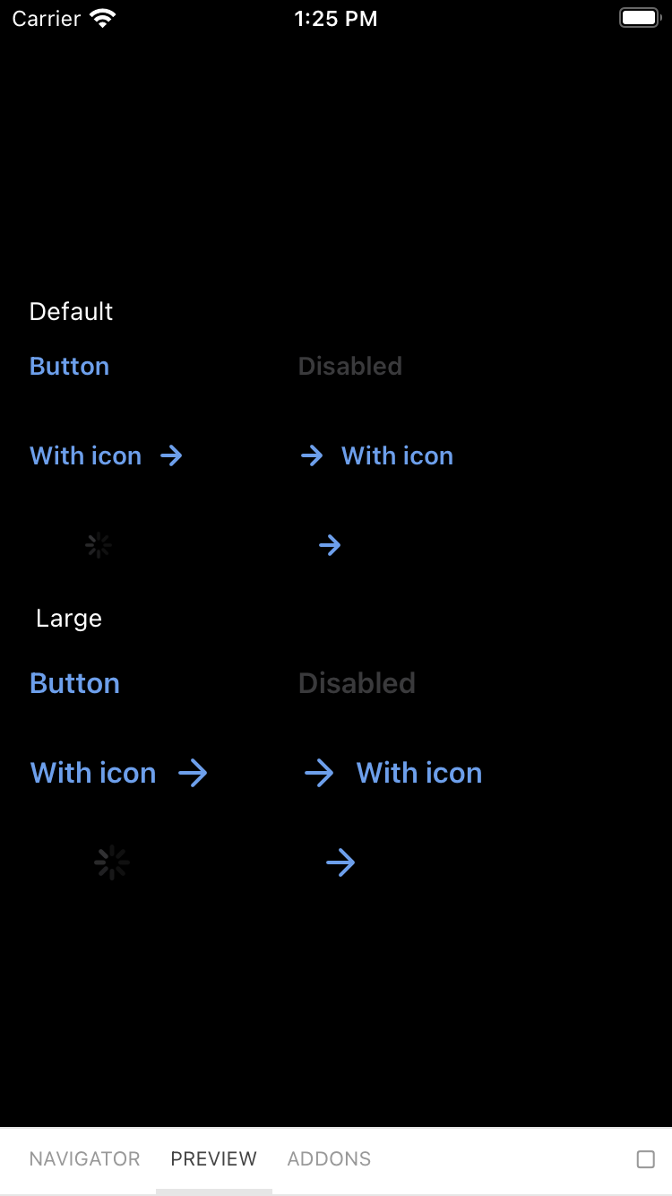
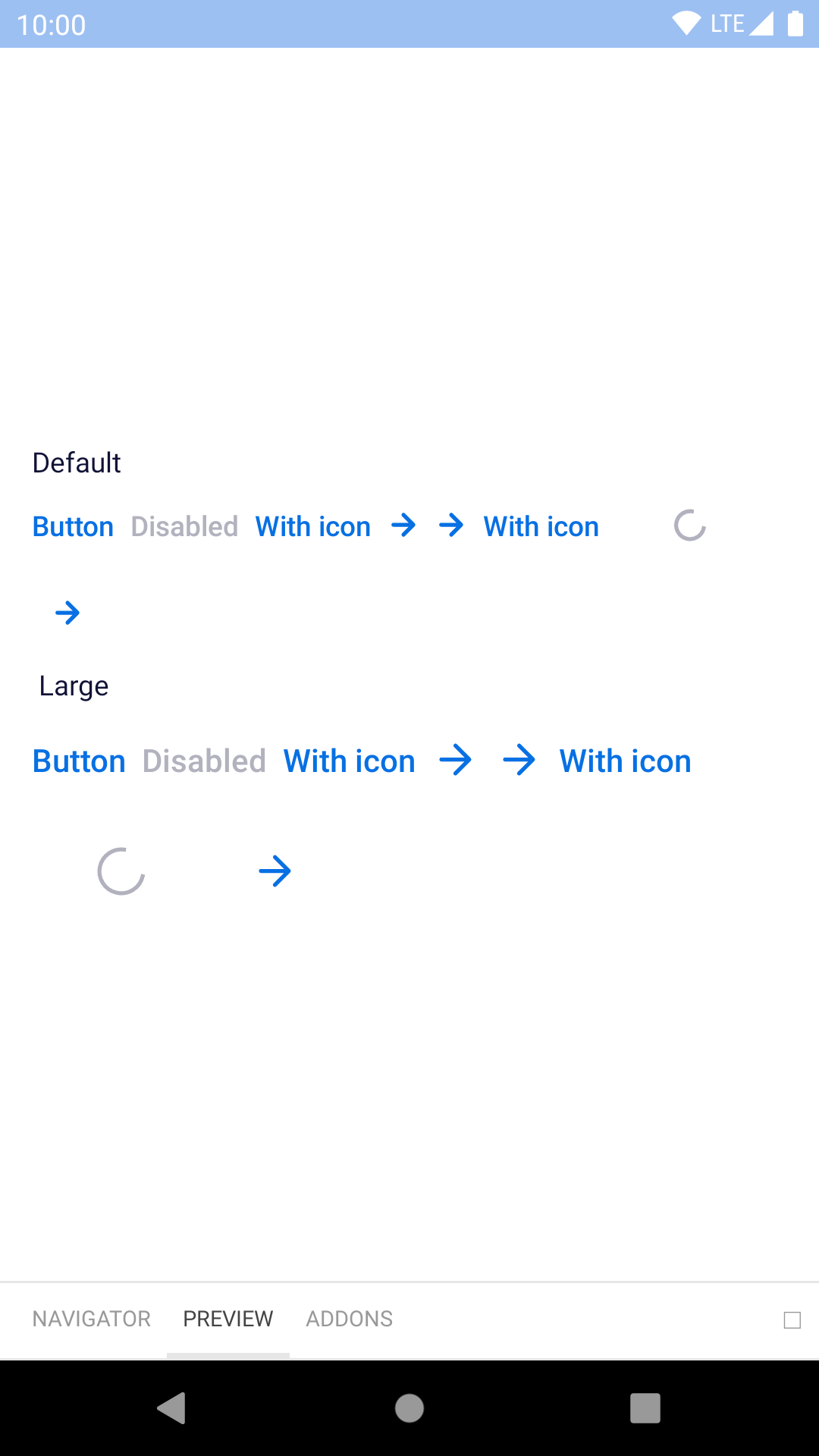
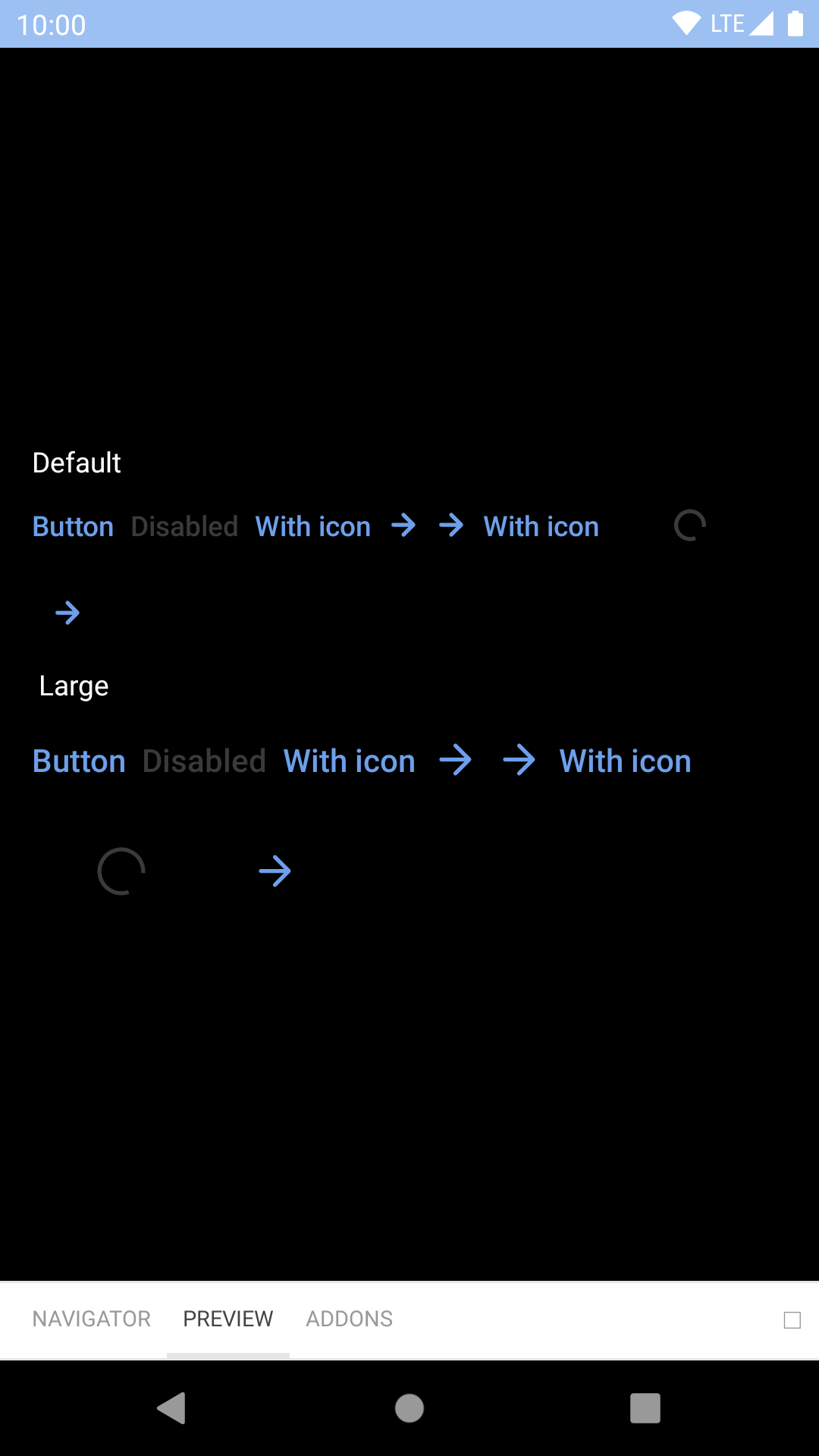
Backpack React Native button component.

Primary

Day Night
bpk-component-button primary iPhone 8 simulator bpk-component-button primary iPhone 8 simulator - dark mode
bpk-component-button primary Google Pixel emulator bpk-component-button primary Google Pixel emulator - dark mode

Primary On Light

Day Night
bpk-component-button primaryOnLight iPhone 8 simulator bpk-component-button primaryOnLight iPhone 8 simulator - dark mode
bpk-component-button primaryOnLight Google Pixel emulator bpk-component-button primaryOnLight Google Pixel emulator - dark mode

Primary On Dark

Day Night
bpk-component-button primaryOnDark iPhone 8 simulator bpk-component-button primaryOnDark iPhone 8 simulator - dark mode
bpk-component-button primaryOnDark Google Pixel emulator bpk-component-button primaryOnDark Google Pixel emulator - dark mode

Secondary

Day Night
bpk-component-button secondary iPhone 8 simulator bpk-component-button secondary iPhone 8 simulator - dark mode
bpk-component-button secondary Google Pixel emulator bpk-component-button secondary Google Pixel emulator - dark mode

Secondary On Dark

Day Night
bpk-component-button secondaryOnDark iPhone 8 simulator bpk-component-button secondaryOnDark iPhone 8 simulator - dark mode
bpk-component-button secondaryOnDark Google Pixel emulator bpk-component-button secondaryOnDark Google Pixel emulator - dark mode

Destructive

Day Night
bpk-component-button destructive iPhone 8 simulator bpk-component-button destructive iPhone 8 simulator - dark mode
bpk-component-button destructive Google Pixel emulator bpk-component-button destructive Google Pixel emulator - dark mode

Featured

Day Night
bpk-component-button featured iPhone 8 simulator bpk-component-button featured iPhone 8 simulator - dark mode
bpk-component-button featured Google Pixel emulator bpk-component-button featured Google Pixel emulator - dark mode

Link

Day Night
bpk-component-button link iPhone 8 simulator bpk-component-button link iPhone 8 simulator - dark mode
bpk-component-button link Google Pixel emulator bpk-component-button link Google Pixel emulator - dark mode

Link On Dark

Day Night
bpk-component-button linkOnDark iPhone 8 simulator bpk-component-button linkOnDark iPhone 8 simulator - dark mode
bpk-component-button linkOnDark Google Pixel emulator bpk-component-button linkOnDark Google Pixel emulator - dark mode

Installation

Check the main Readme for a complete installation guide.

Usage

import { StyleSheet, View } from 'react-native';
import React, { Component } from 'react';
import { BUTTON_TYPES, ICON_ALIGNMENTS, BpkButtonV2 } from 'backpack-react-native/bpk-component-button';
import { spacingBase } from '@skyscanner/bpk-foundations-react-native/tokens/base.react.native';

const styles = StyleSheet.create({
  container: {
    flex: 1,
    justifyContent: 'center',
    padding: spacingBase,
  }
});

export default class App extends Component {
  render() {
    return (
      <View style={styles.container}>
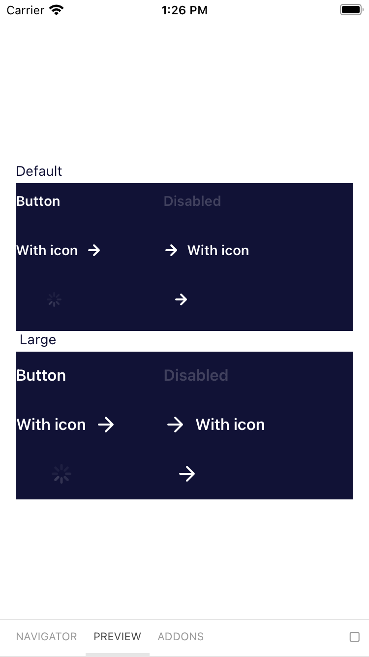
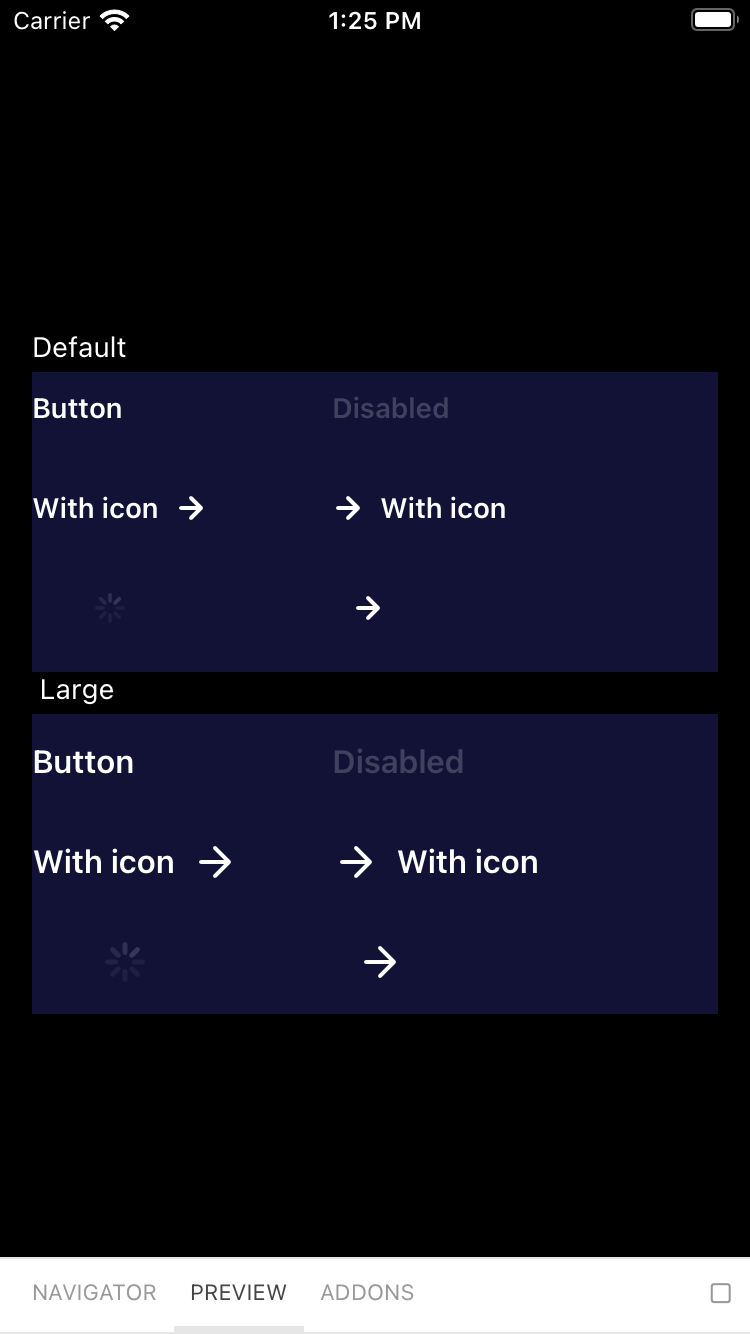
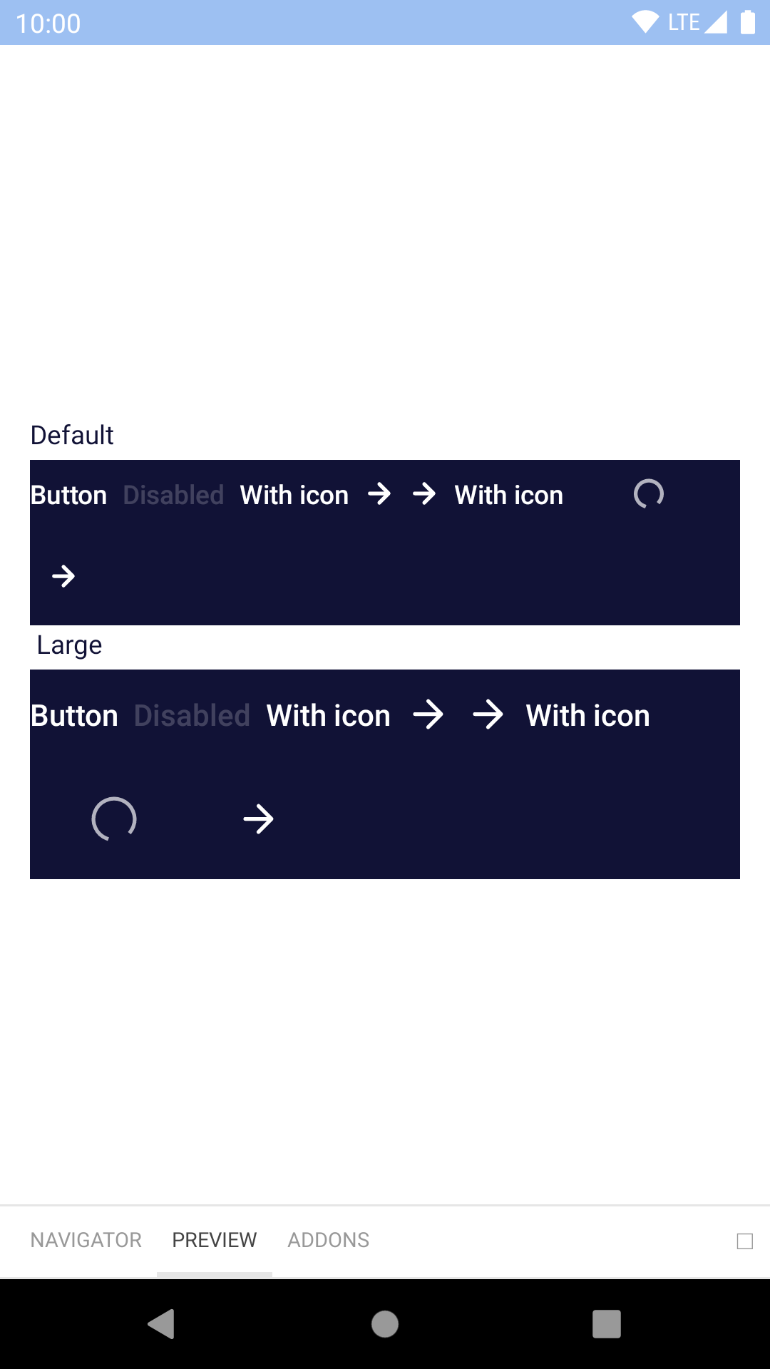
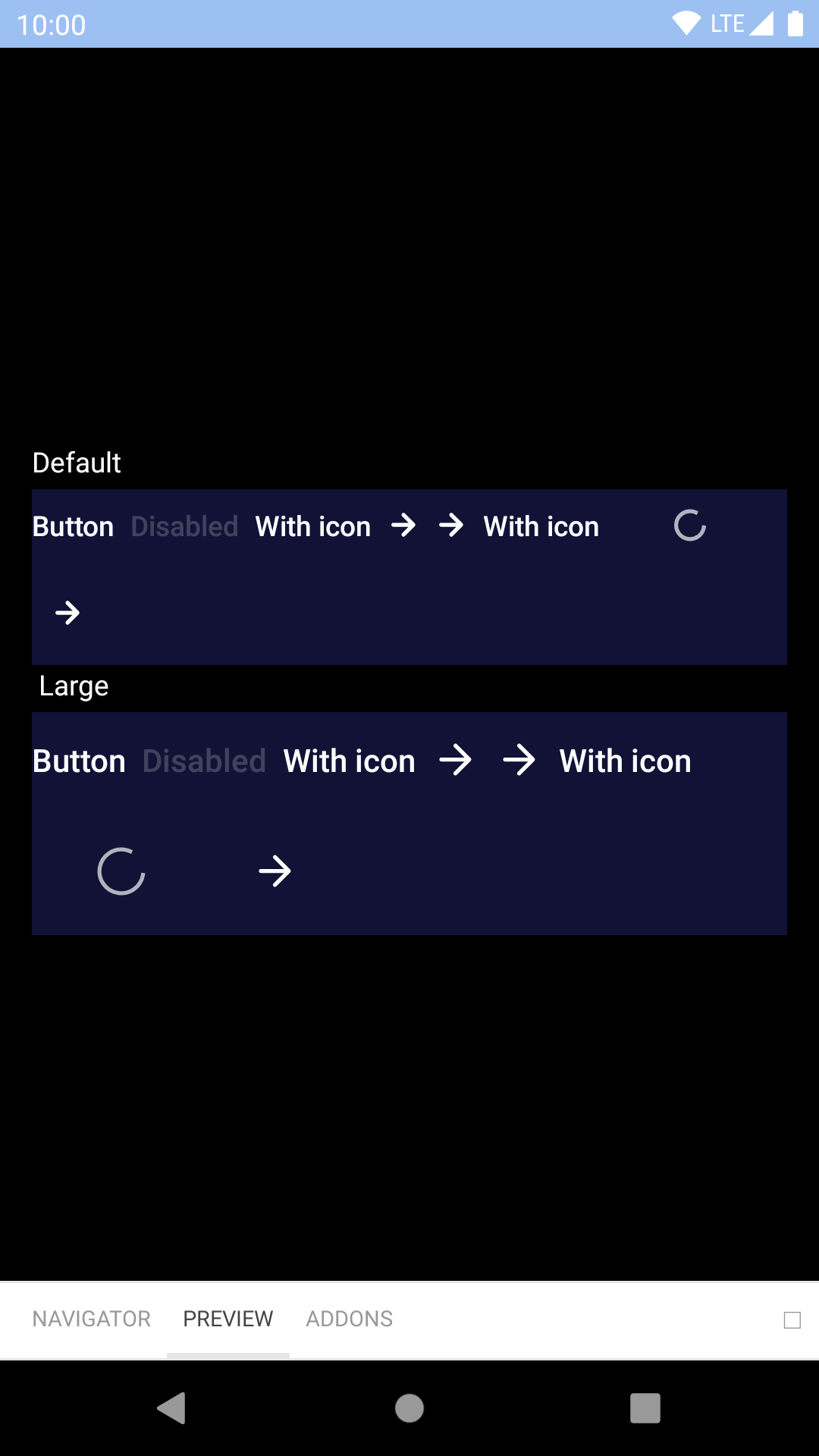
        <BpkButtonV2
          type={BUTTON_TYPES.primary}
          title="Book flight"
          onPress={() => {}}
        />
        <BpkButtonV2
          type={BUTTON_TYPES.featured}
          title="Book flight"
          onPress={() => {}}
        />
        <BpkButtonV2
          disabled
          type={BUTTON_TYPES.destructive}
          title="Book flight"
          onPress={() => {}}
        />
        <BpkButtonV2
          large
          type={BUTTON_TYPES.primary}
          title="Book flight"
          onPress={() => {}}
        />
        <BpkButtonV2
          type={BUTTON_TYPES.featured}
          title="Book flight"
          icon="baggage"
          onPress={() => {}}
        />
        <BpkButtonV2
          type={BUTTON_TYPES.primary}
          title="Book flight"
          icon="baggage"
          iconAlignment={ICON_ALIGNMENTS.leading}
          onPress={() => {}}
        />
        <BpkButtonV2
          type={BUTTON_TYPES.featured}
          title="Book flight"
          icon="baggage"
          iconOnly
          onPress={() => {}}
        />
      </View>
    );
  }
}

Props

Property PropType Required Default Value
onPress func true -
title string true -
accessibilityLabel string false props.title
disabled bool false false
icon oneOf(string, element) Strings must be a BpkIcon false null
iconAlignment oneOf('leading', 'trailing') false trailing
iconOnly bool false false
large bool false false
type oneOf('primary', 'featured', 'secondary', 'destructive', 'primaryOnLight', 'primaryOnDark', 'secondaryOnDark', 'link', 'linkOnDark') false null